France TV Education
Iconography
Iconography
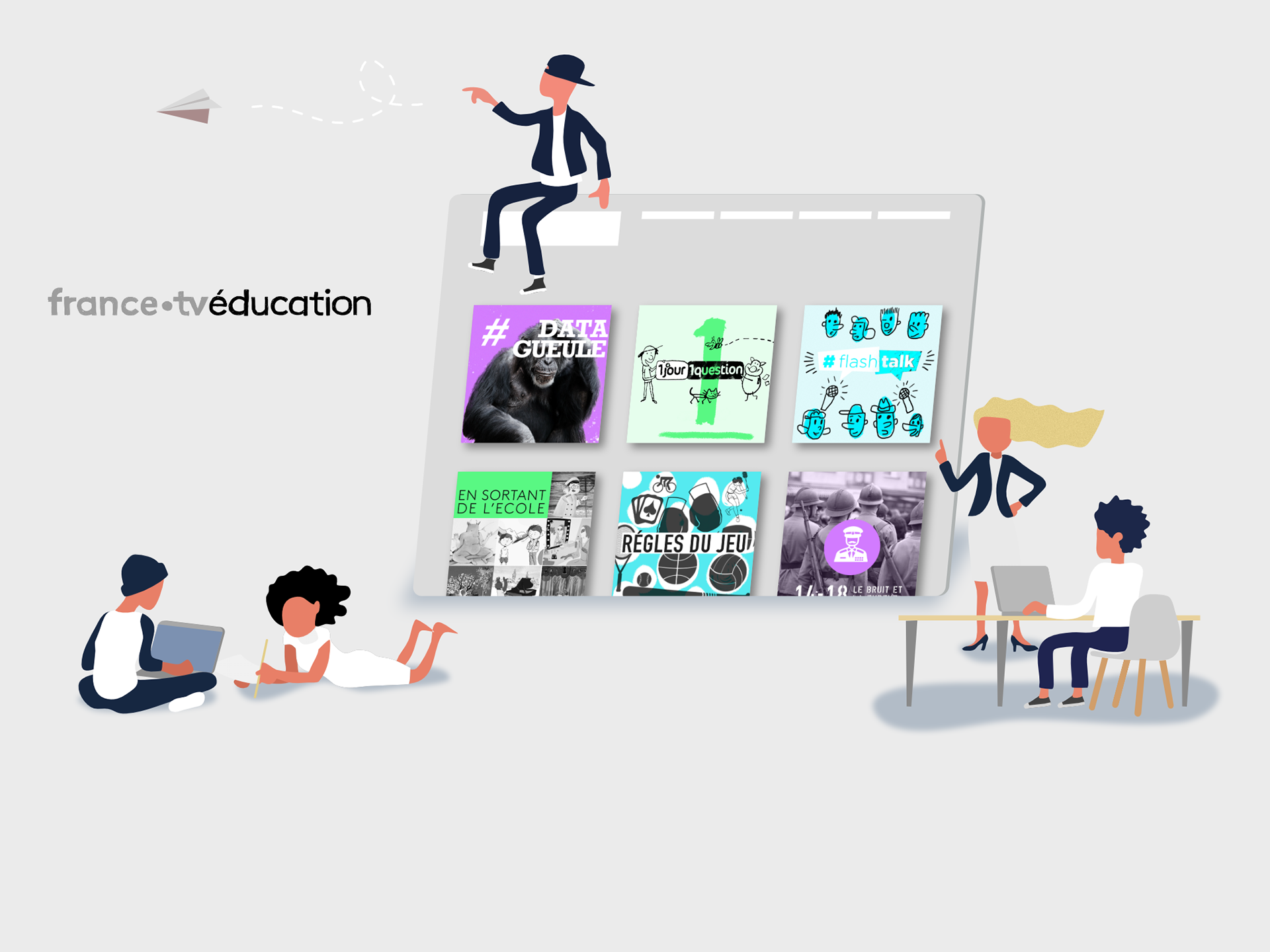
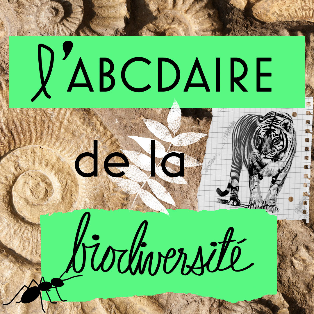
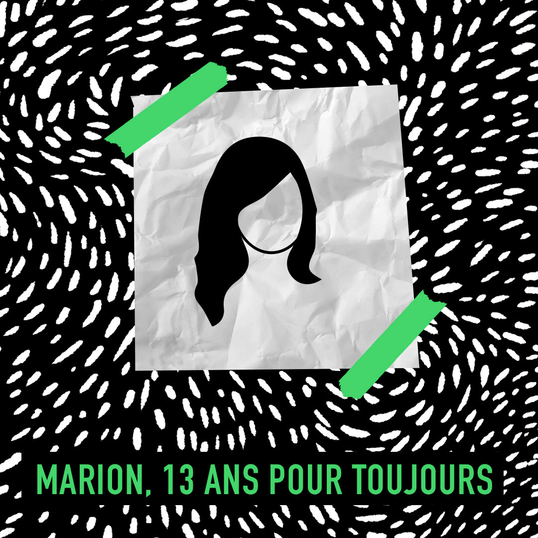
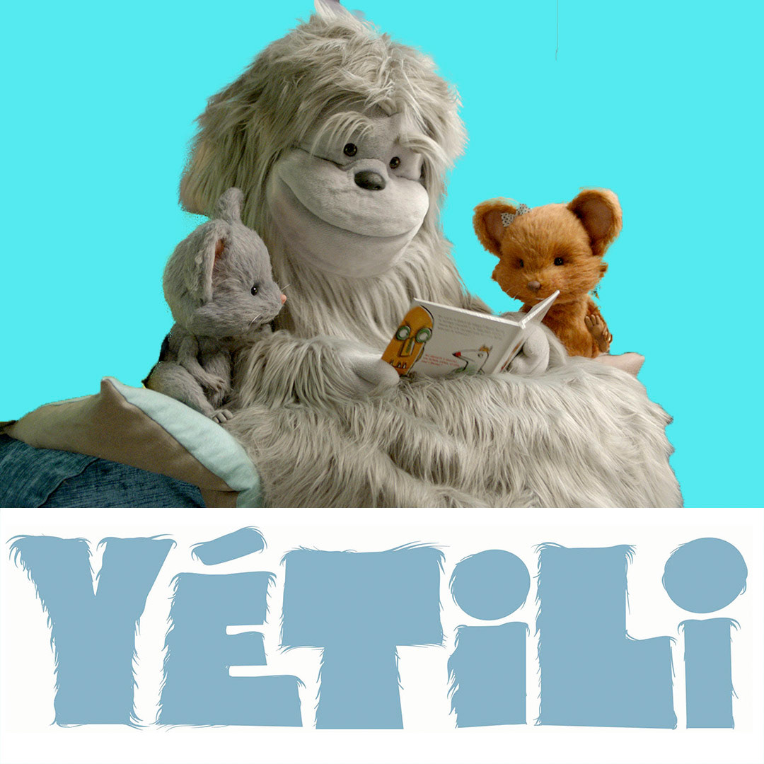
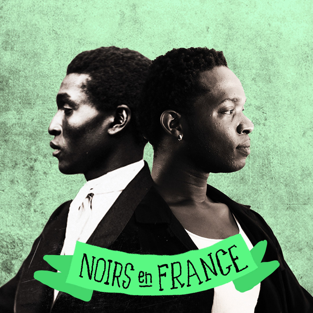
In collaboration with the UX lead, we decided to establish a way for users to find the content they are looking for using a limited colour palette, using the dominant colour plus black and white.


The objective : to create an iconography that is appealing and friendly to students and teachers, using visual cues, such as color, to help users find content relevant to their research. Branding FTV content while assisting students and educators find information relevant to their subject or education level. Education can be appealing and interesting. Much attention is given to entertainment, when attention could be given to education.
I was very inspired by a website of journalism called The Lily because their design-first work method and tight collaboration with the journalists.
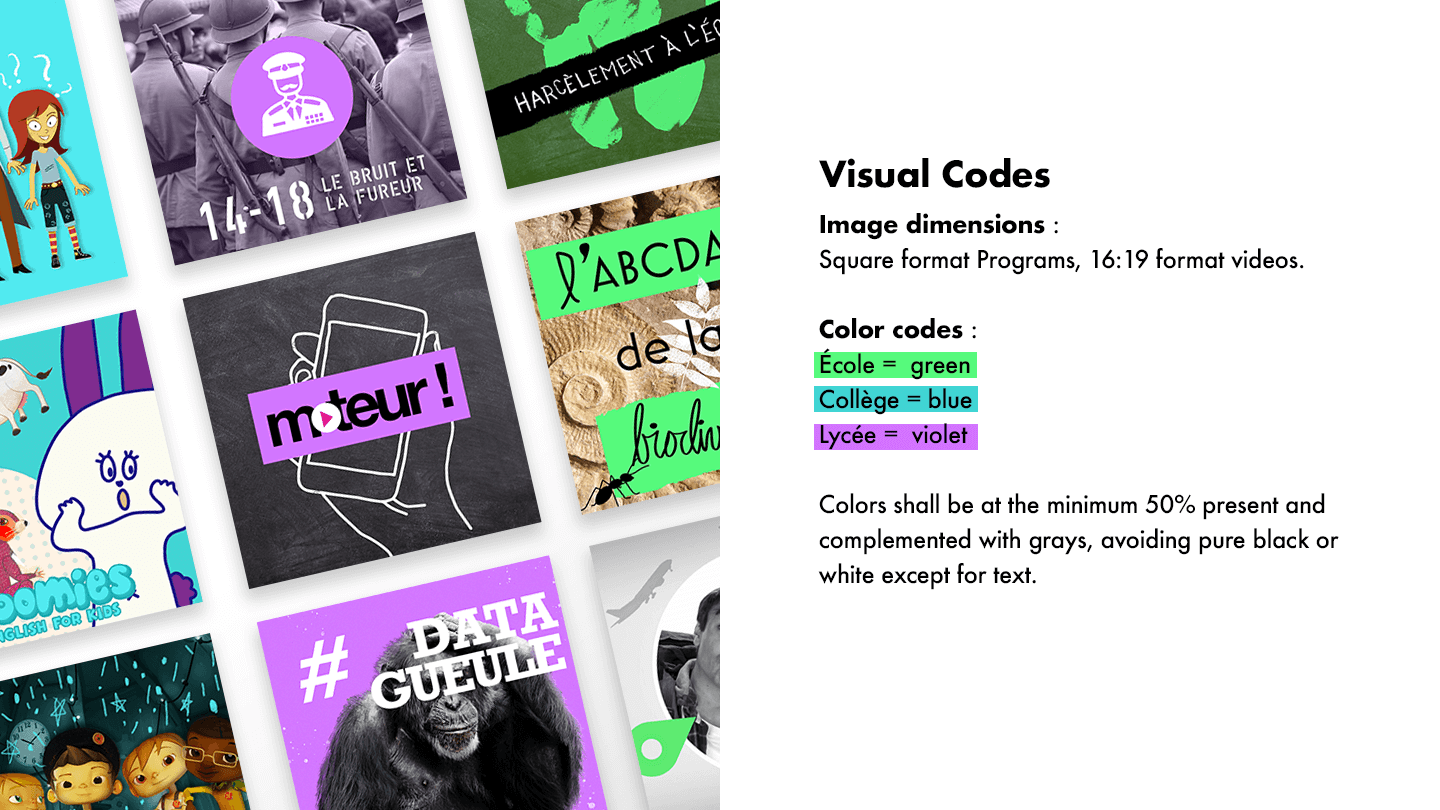
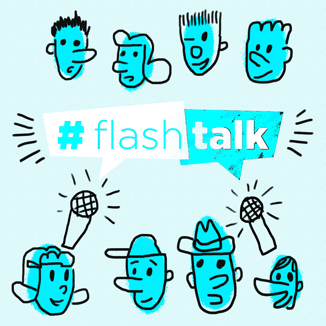
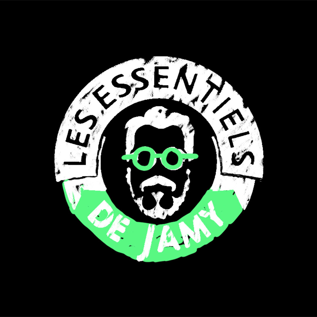
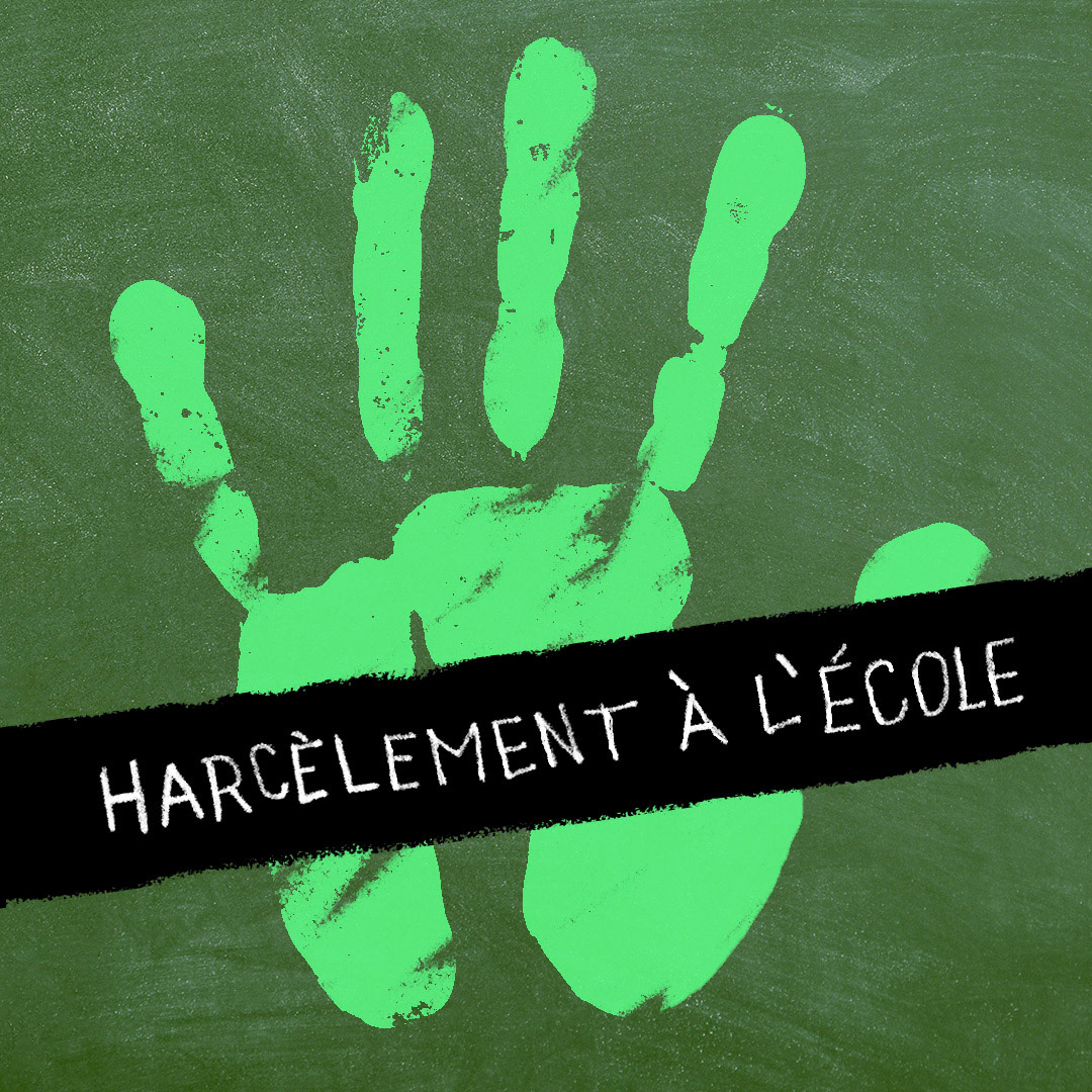
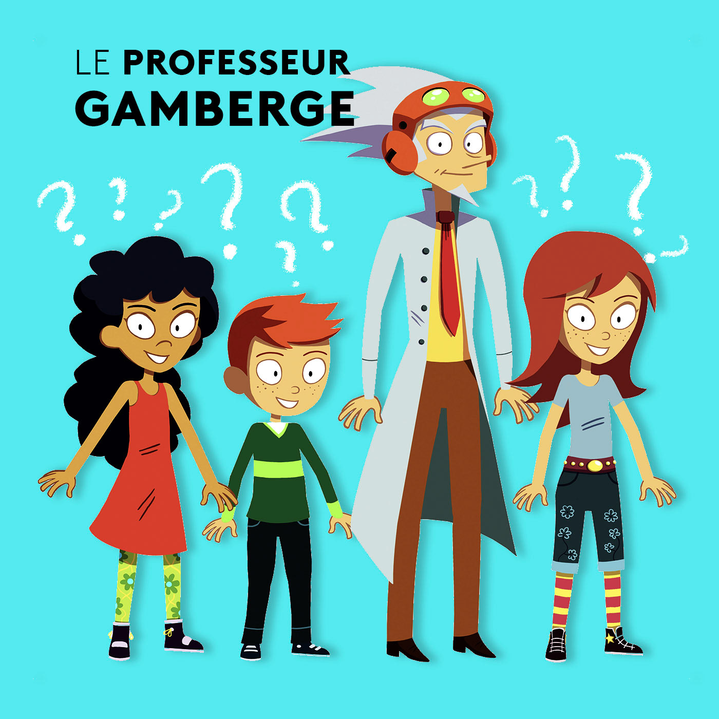
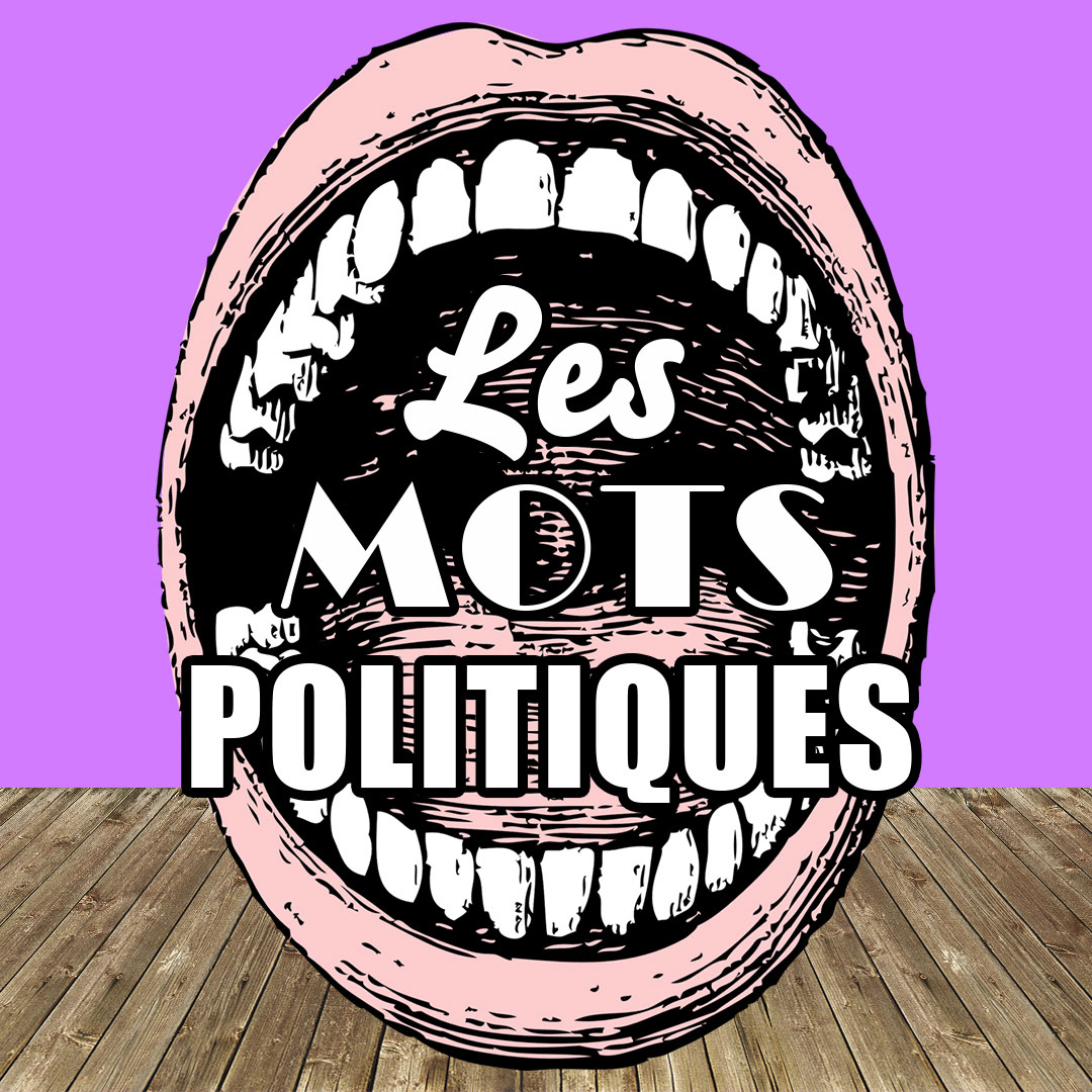
Color codes help those who are visual learners find what content they may be looking for. The color codes are explained above.


This project was personally gratifying as I was able to use my sensibilities as an illustrator that I was and the designer that I am now. I enjoyed working with the concepts and constraints that we put in place to make the iconography communicate using these codes. A true marriage of design and content.