The Challenge : take an existing business or commerce and improve it.
Why?
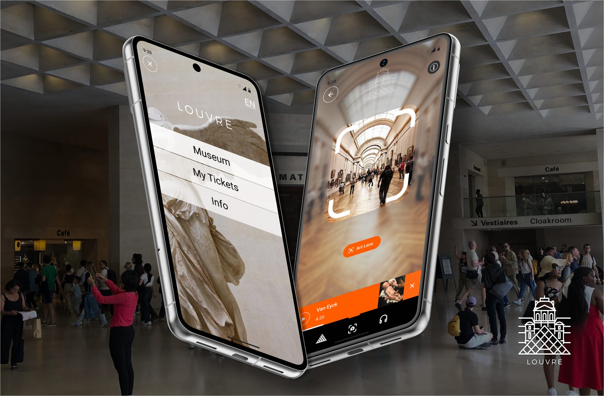
I want to contribute to the appreciation of the Louvre, for me it is a collection of extraordinary beauty from around the world, spanning centuries and civilisations, some of which no longer exist. Today, it is more relevant than ever, as we become digitally dependent. It presents a good challenge that deserves a good solution.
What?
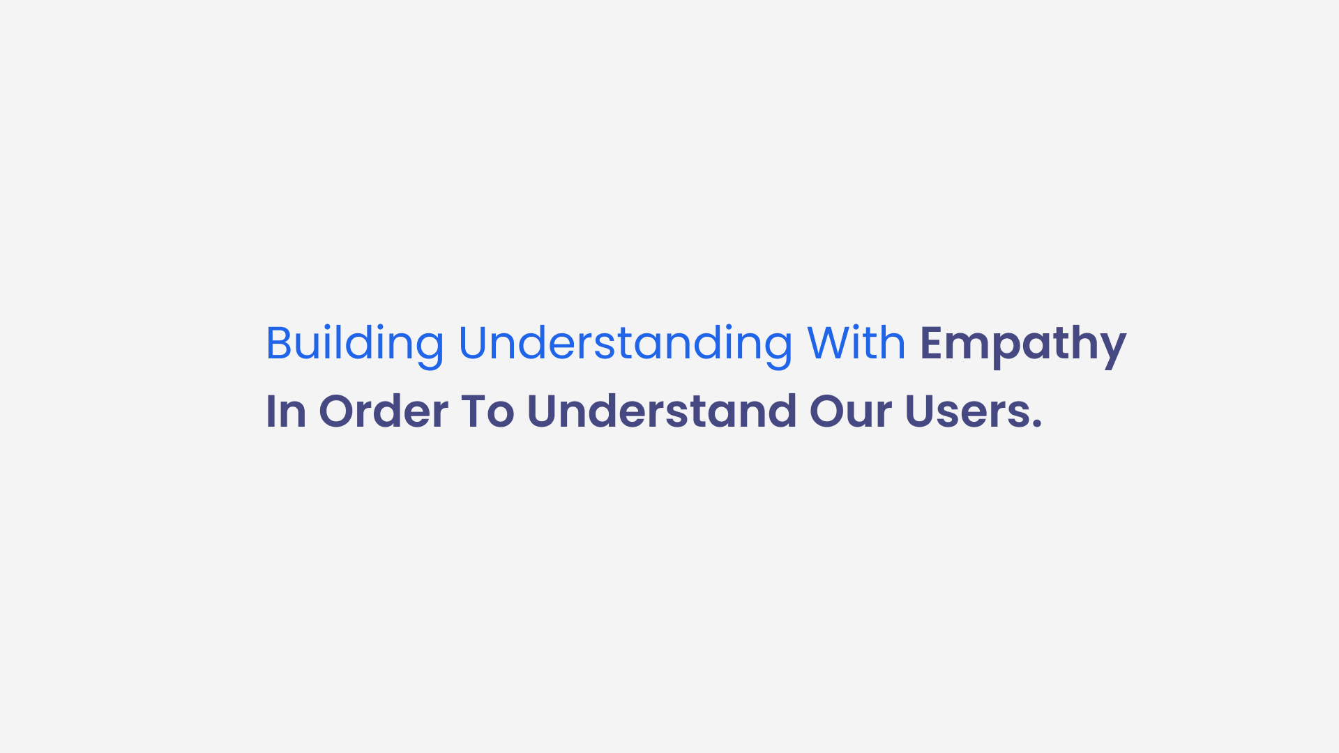
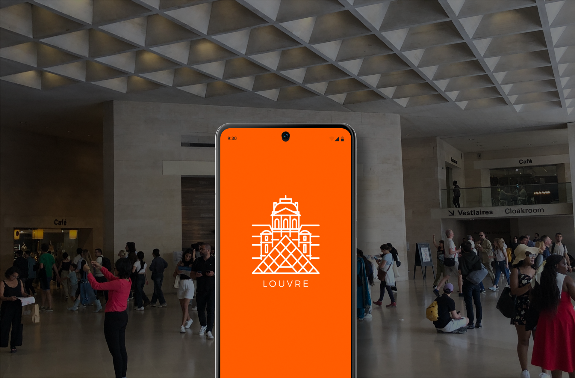
This is a 2 week long project consisting of User Research and User Interface solutions. I describe this project as an "ideal museum companion". I worked independently on this project while a student at IRONHACK, I had the support of my teacher and mentor, for which I am grateful for the support and encouragement of him as well as my classmates. I would like to share with you the project.
As you know already...

User Research
Interviews helped to identify "pain points" and "difficulties" being experienced. This helped us understand how users feel about the museum and their experience.
The most insightful information came from going to the museum to do the interviews and from observation. This came to me as a surprise...I went there like an "open book" just taking everything in, taking photos, taking notes, talking with people visiting and talking with people working there, observing what was working versus what wasn't. It was incredible. I learned the importance to observe "for the first time".
Separately, I created a survey to gather data about visitors habits, preferences and expectations.

What is the Minimum Viable Product?
Here, by looking at other sources and existing models, we can understand what the activities and solutions being offered other museums. What is their value offer? What products or services are they offering and what needs are they responding to. For whom are we creating value? And who will benefit? These are good questions that help to get shareholder and stakeholder support.

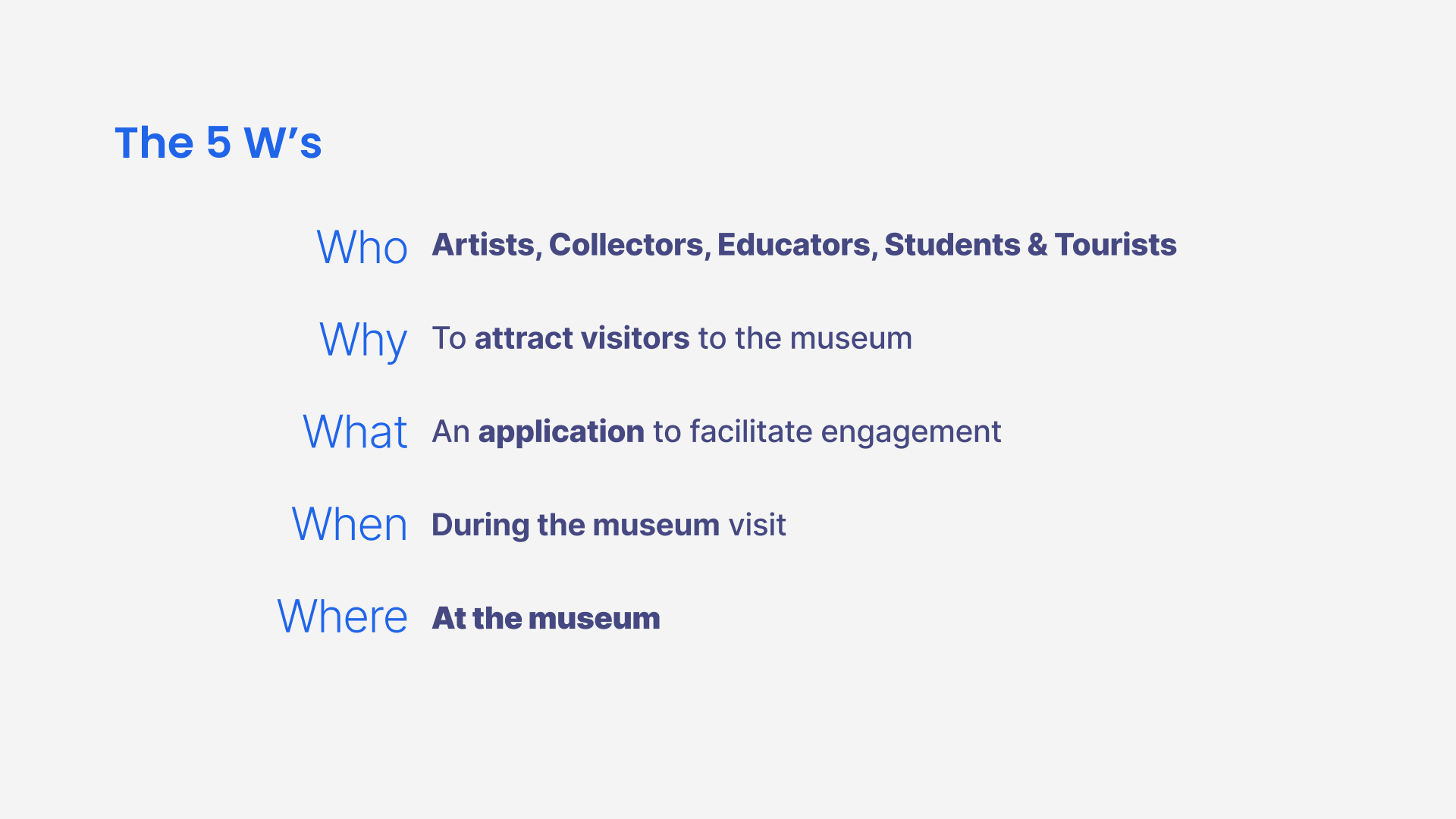
When creating a product or a service
We should be able to define these things, they are called the 5 W's. Anyone care to tell me what it is called in French? Oui, je sais mais, c'est moins joli.
Affinity Mapping
Patterns of data and repeating information informs the significance of such information. This deserves a keen eye and with a team effort you can determine important difficulties and vote on their level of importance. I had to move very quickly and I was the UX and the UI designer, being a solitary contributor is not advantageous and is limiting the depth and breadth of research, lacking diversity and time, this is my regret.
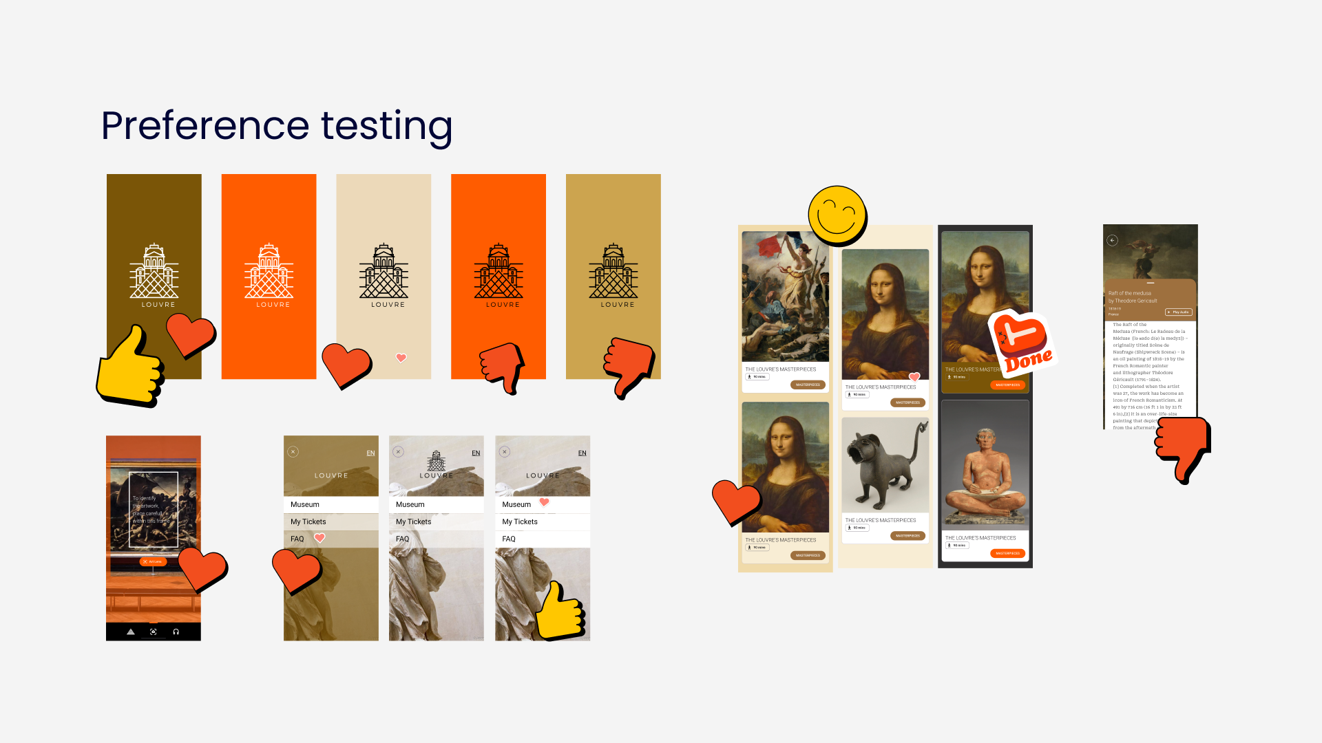
To manage my time, I had used Notion to make my planning and thank goodness because it kept me on track, to meet my objectives and not get behind, during this phase of research I allowed myself to run a little longer because it is very important. I gave a little more time knowing that I could advance more clearly and efficiently with the research that was going to help. I knew the UI should be simple and functional without too many features or functions.
To manage my time, I had used Notion to make my planning and thank goodness because it kept me on track, to meet my objectives and not get behind, during this phase of research I allowed myself to run a little longer because it is very important. I gave a little more time knowing that I could advance more clearly and efficiently with the research that was going to help. I knew the UI should be simple and functional without too many features or functions.
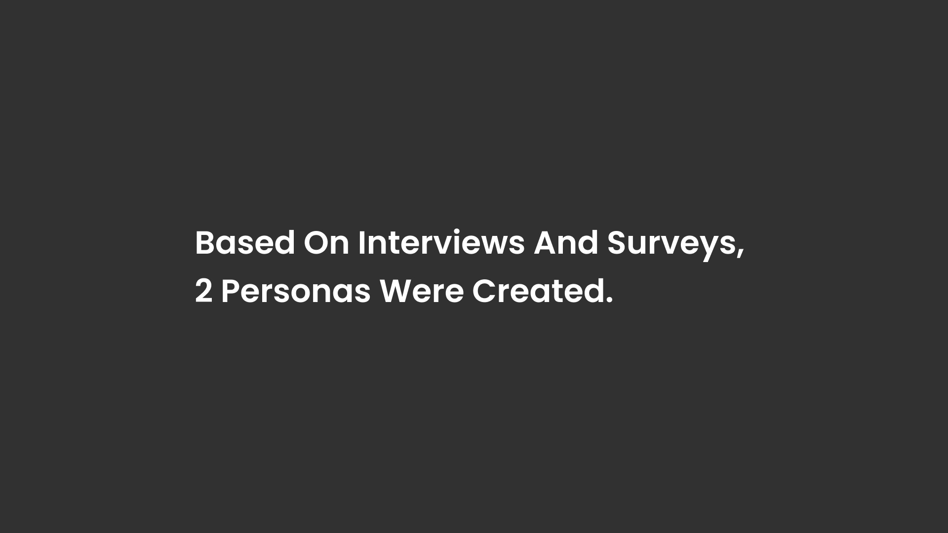
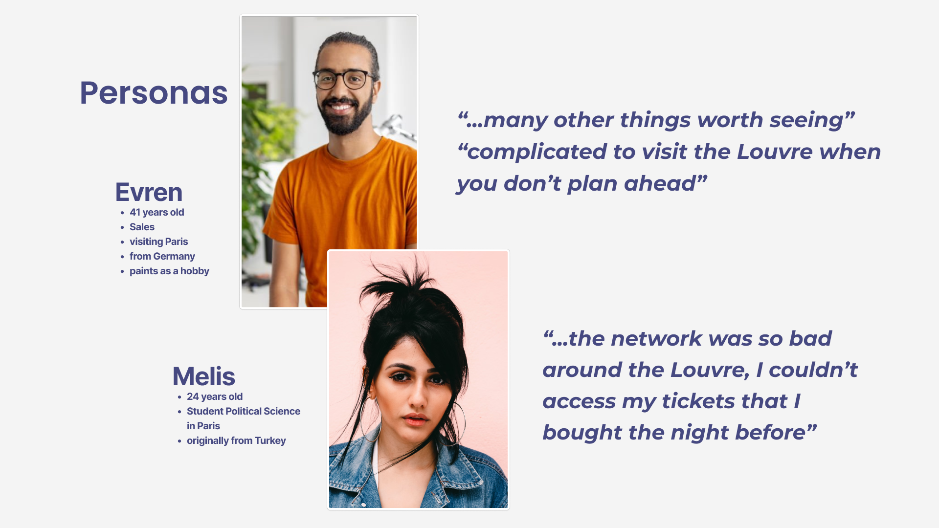
I present to you Evren and Melis.
User Journey
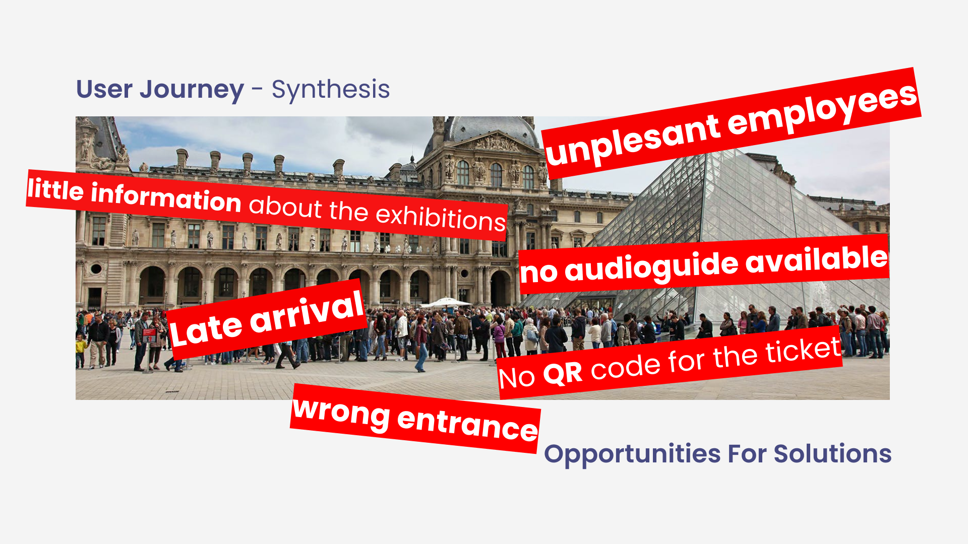
Opportunities
All these "bad" or negative things are opportunities for solutions. We shall respond to these "pain points". Defining the problems successfully means that we have solved 50% of the problem.
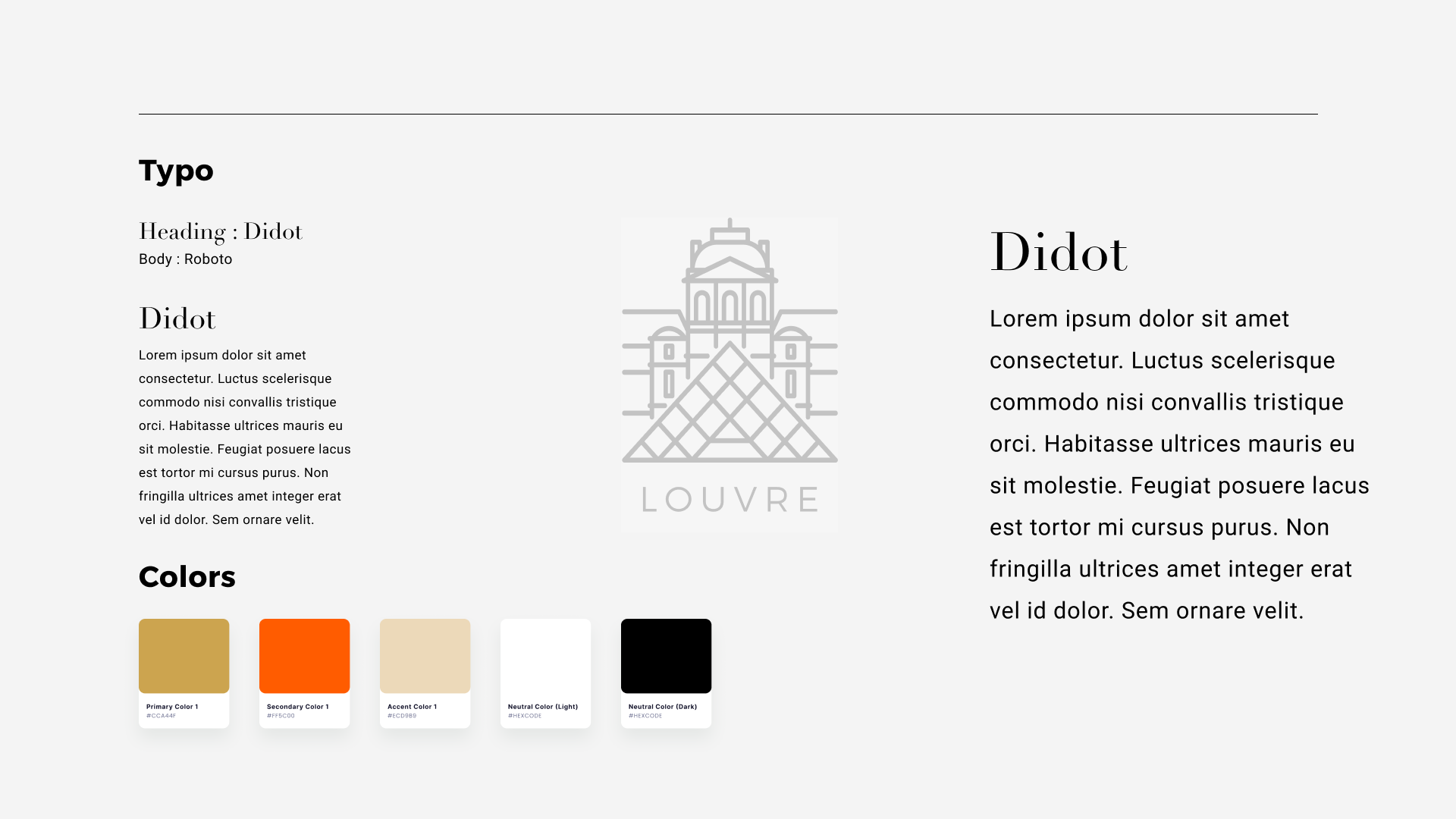
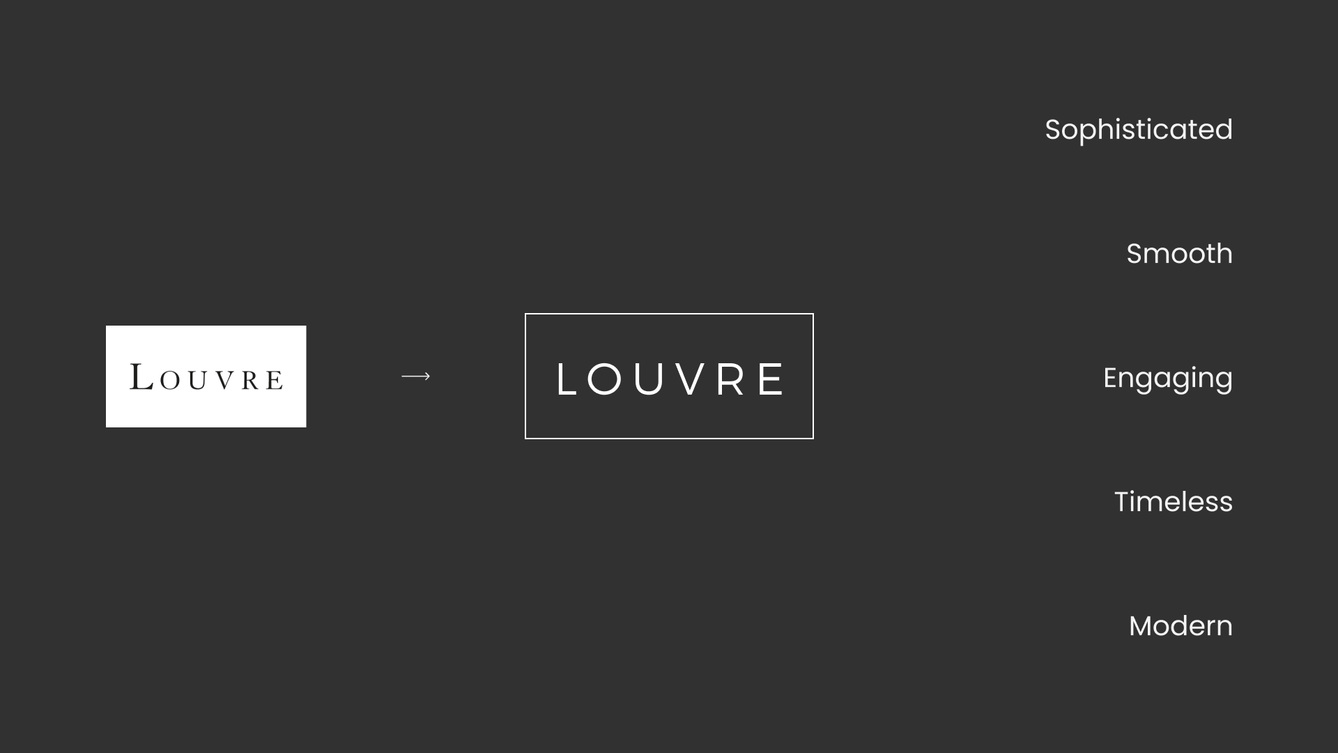
The moodboard
Created to generate some visual ideas of what can be associated with The Louvre, the brand, the institution, the destination.

Some reflections
The existing printed maps are confusing because the museum is on 5 different levels and in 3 different buildings, hundreds of rooms and galleries and corridors.
I observed that people are happy to be there, in Paris at the Louvre, taking selfies with Mona Lisa or in front of the glass pyramid, so as a tourist, "dissatisfaction" gets overshadowed.
Here is the possibility to make this amazing. With the interviews and surveys and observation, I found that users were having difficulty to navigate with maps provided.
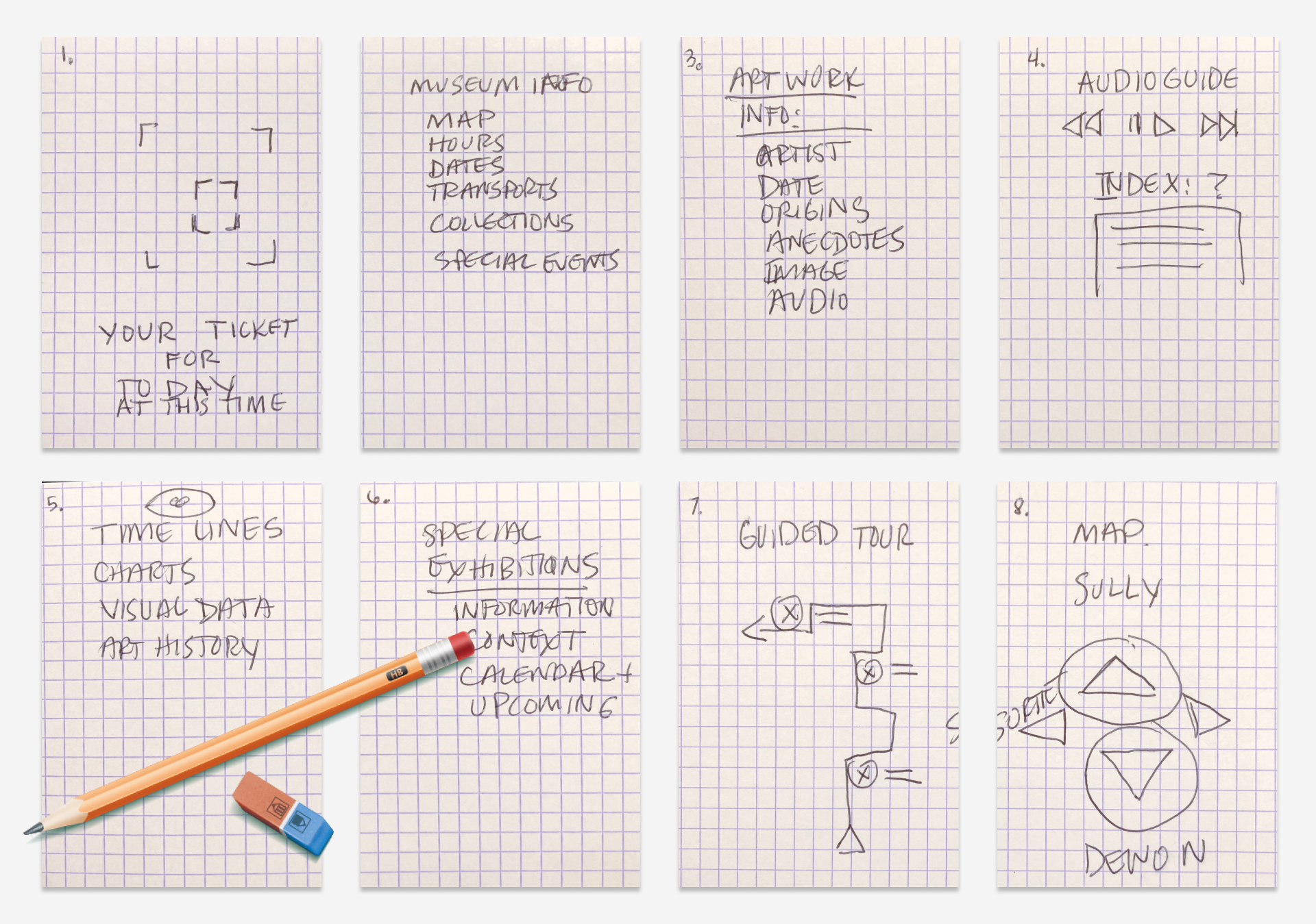
Brainstorming
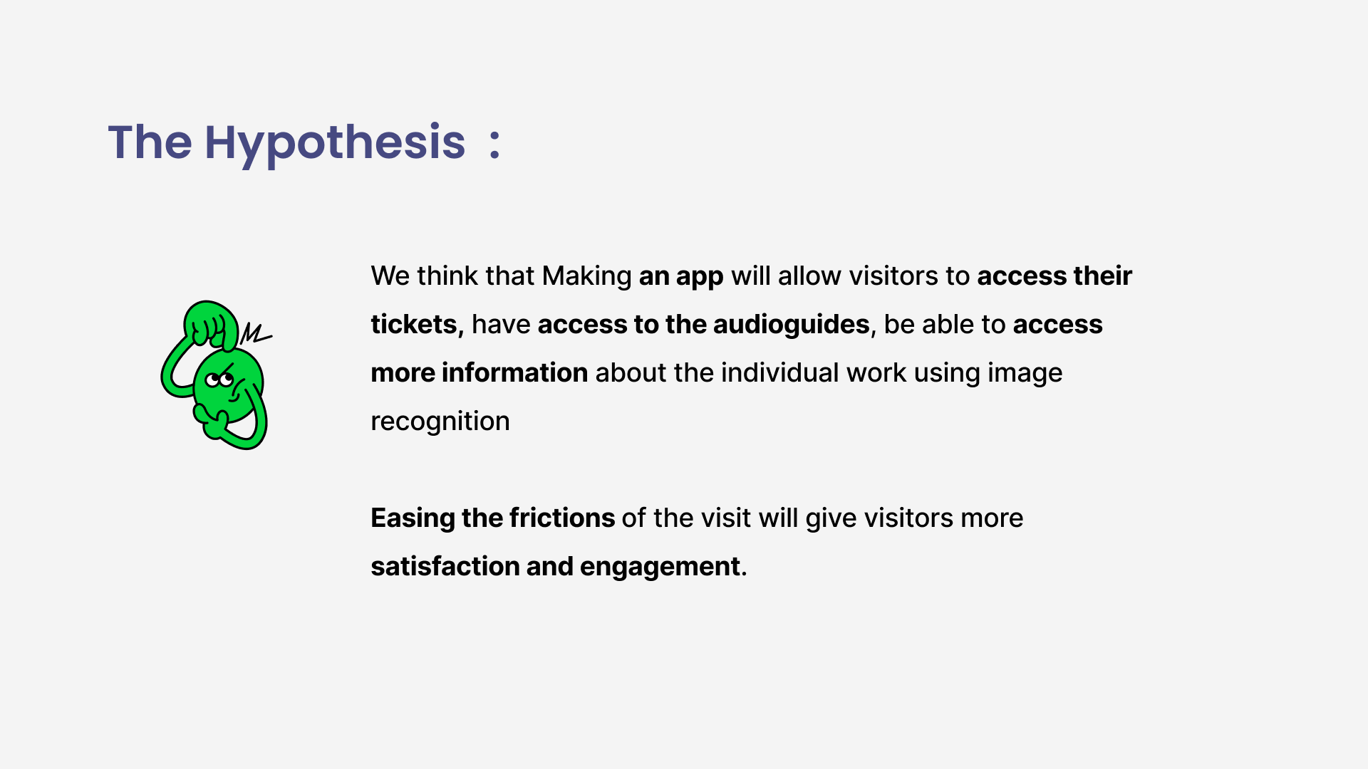
Crazy 8's are eight, one minute drawing of ideas for solutions to Evren and Melis' problems, a response to the needs of our personas Evren and Melis, as they are looking to have access to their tickets at the point of entry, more information about the artwork, access to the audio guide because they were no longer available, and this sense of being lost in the museum. Here we are on a divergent path, open to all possibilities, no matter how absurd.
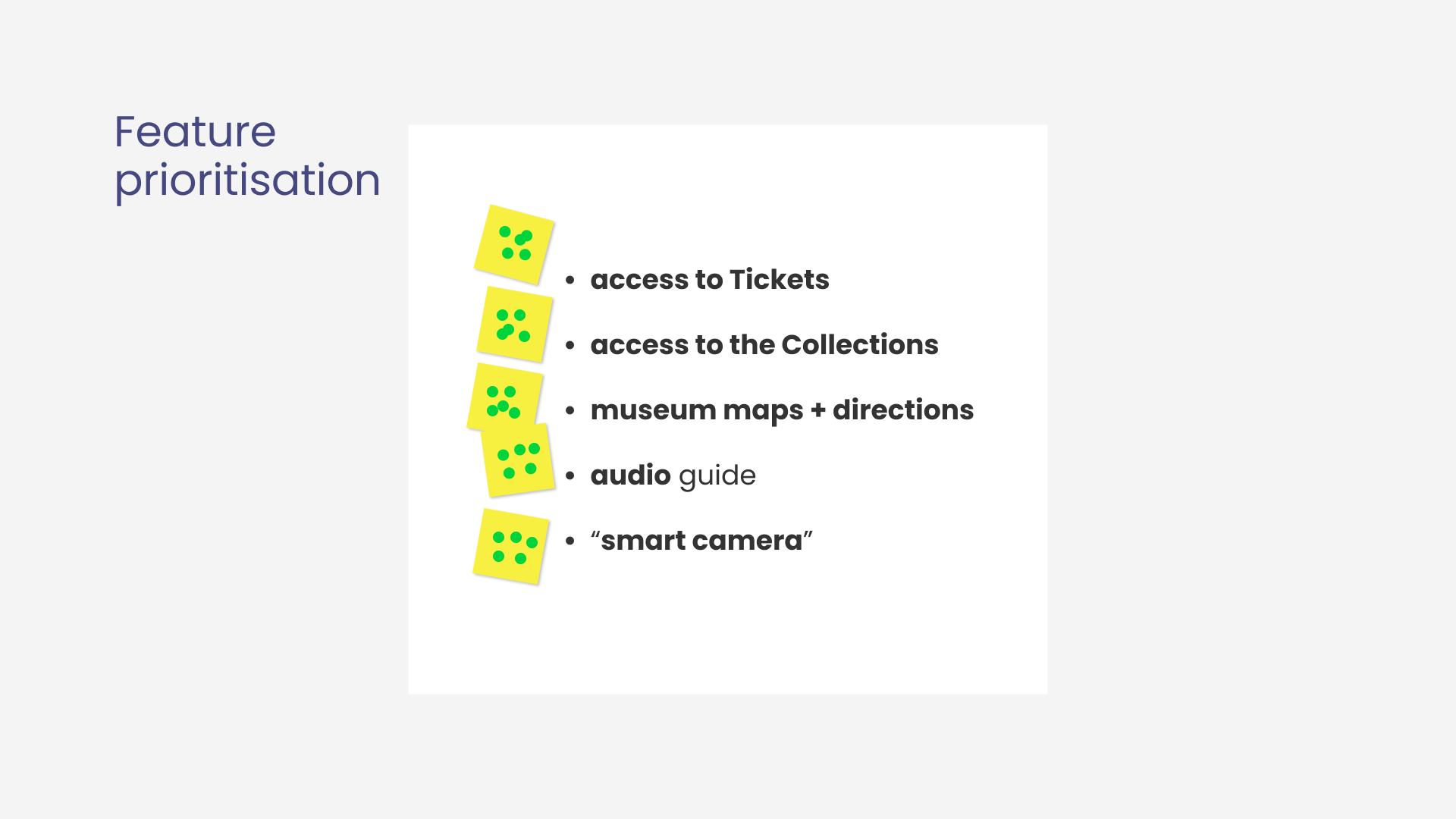
Feature prioritisation
Feature prioritisation, allows us to define the Information Architecture and the site map. While we have defined the problems and responded with some solutions and we shall respond with priorities. We have determined the Should haves, Won't haves, Ought to haves, and the Could haves. We have taken a divergent path by prioritising to only the features which respond to the needs.

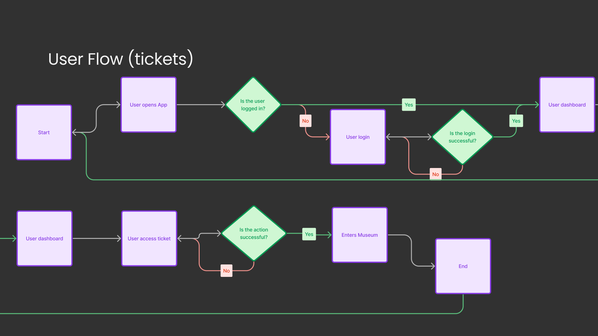
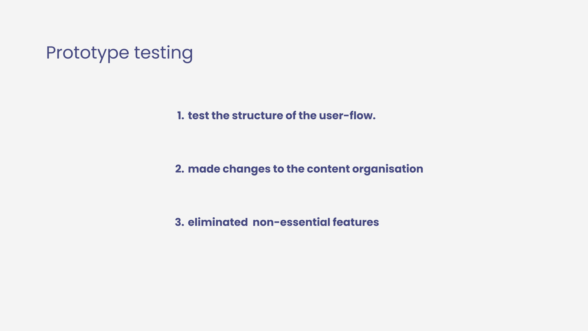
Low-Fidelity prototype
Prototype was created and used to test the proposed solution, a task was given to the user, lessons were learned from the observations. Due to the sprint nature of this particular exercise, that testing was limited in scope yet insights were gathered and applied to another variation.


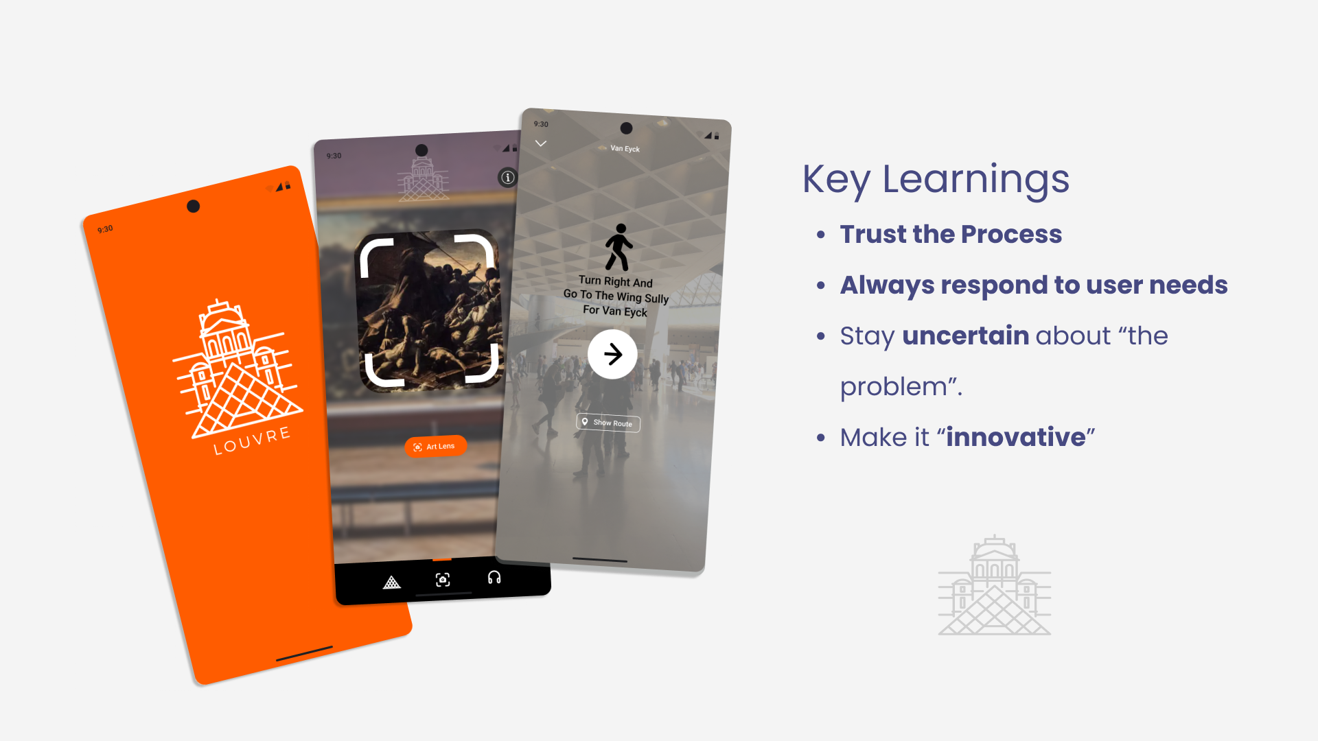
Closing "Comments & Reflections"
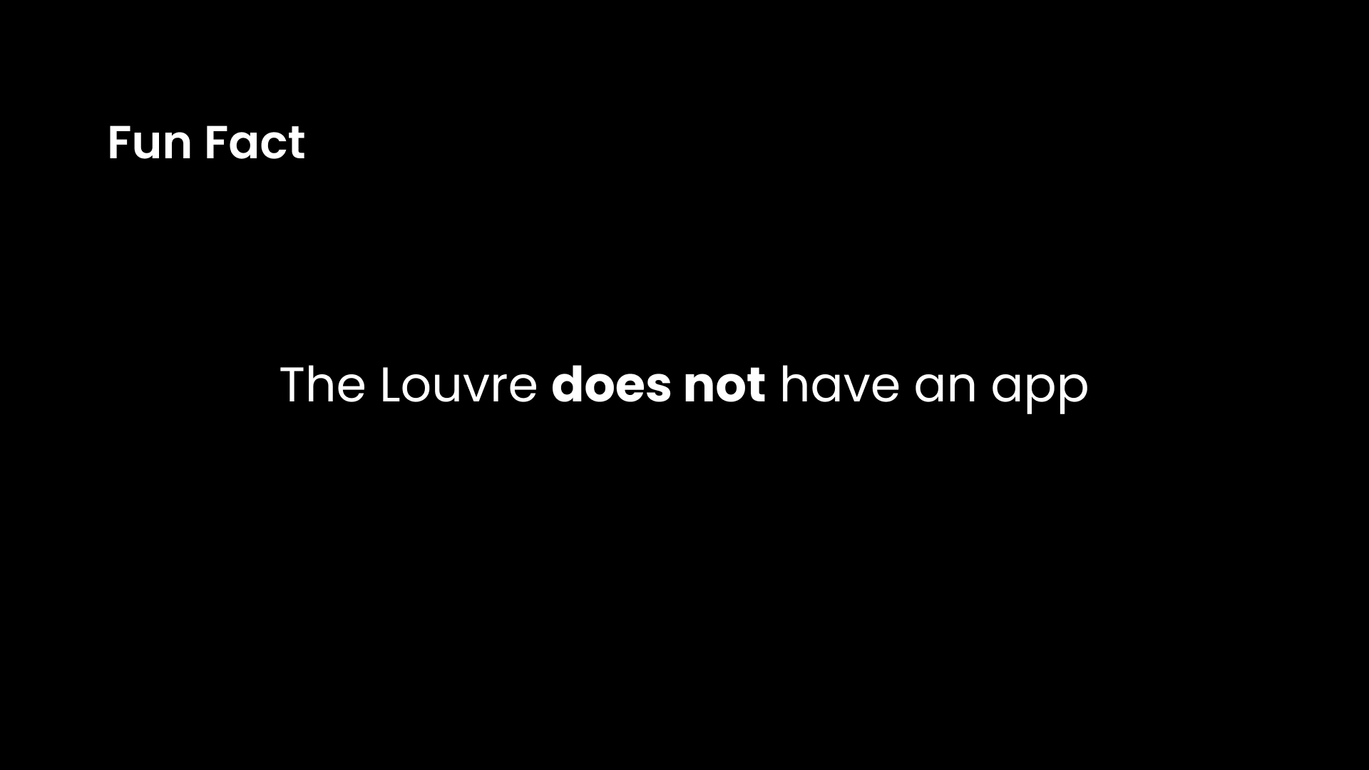
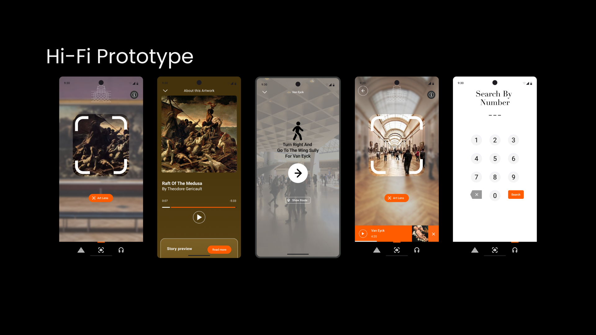
Geo-localisation and Image recognition technologies exist but they have not been put together in this way.
I would love to be part of the ongoing development of this app, I would like to see it evolve.
Very important to have a planning to meet objectives and deadlines

Thanks for your visit.