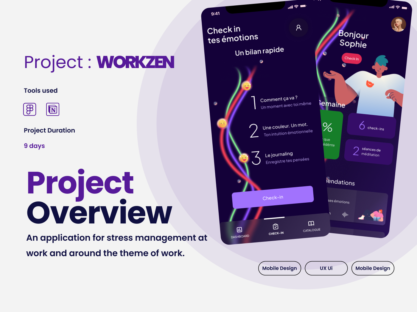


App redesign : BANDSINTOWN
Project Overview
This is a User Interface (UI) Design project redesign for the Bandsintown application. To give you some context, Bandsintown is a concert discovery app and it pulls data from a user's music streaming accounts to pre-populate a customised list of tracked artists and local concert recommendations. Tour dates are collected from more than 200 primary ticket providers and booking agencies, as well as the artists directly.
I chose this app because I love music, it seems useful but the interface is not-friendly and uninspiring. I used Figma for the wireframes and prototypes, Mobbin for inspiration and Design patterns.
I chose this app because I love music, it seems useful but the interface is not-friendly and uninspiring. I used Figma for the wireframes and prototypes, Mobbin for inspiration and Design patterns.
What
We are redesigning the iOS native version, focusing on 3 principle screens of a user journey for the Visual Design.

Before & after : home
Phase 1
I began the project with a Heuristic analysis of the existing app. I conducted an investigation of what the competitors are doing and I studied Design Patterns of similar applications to understand what other users might be seeing and expecting. I then proceeded to experiment with a different content structure and information organisation. After this, I had more understanding and appreciation of what might be the opportunities to make this product more attractive.
Phase 2
The current app suffers from a lack of energy and fun, so I tried to put that back into the app. The Bandsintown brand is catering to music enthusiasts, who are looking for fun and seeking joy and excitement.
My strategy was to put some variety in the layout, to clarify the grouping of elements using cards, a clear hierarchy of type styles, dynamic use of images and typography.
I sought to create a variety of "card" shapes that could be vertical, horizontal, and to define the minimum and maximum sized dimensions, to have more dynamic and varied options for the layout.
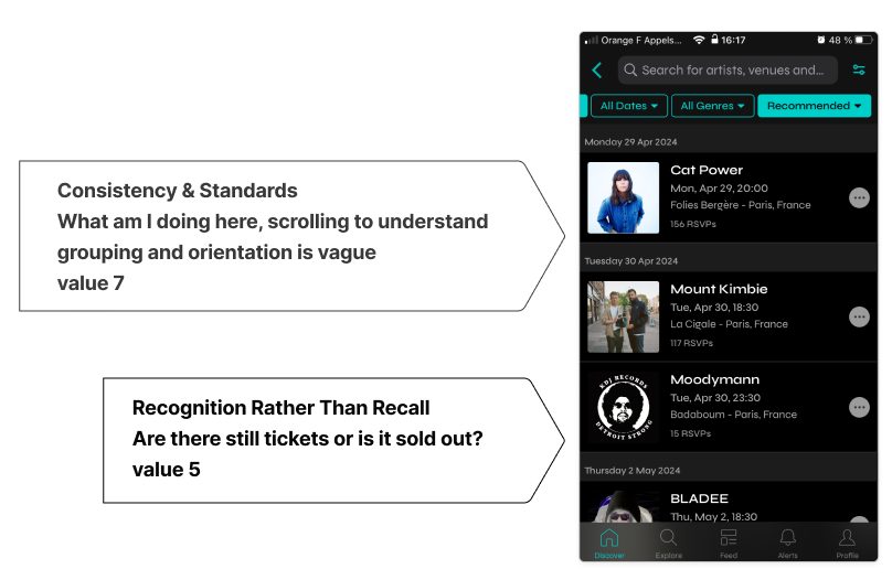
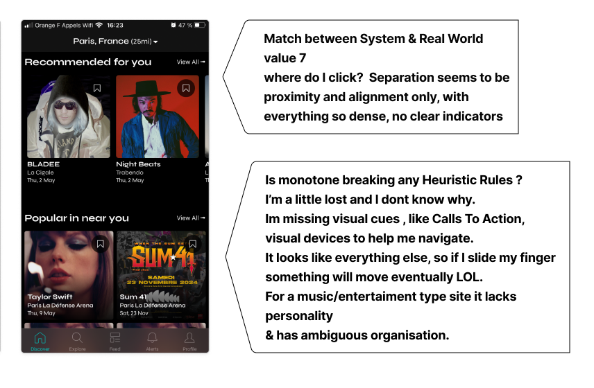
Heuristic analysis details
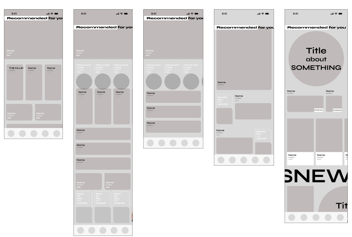
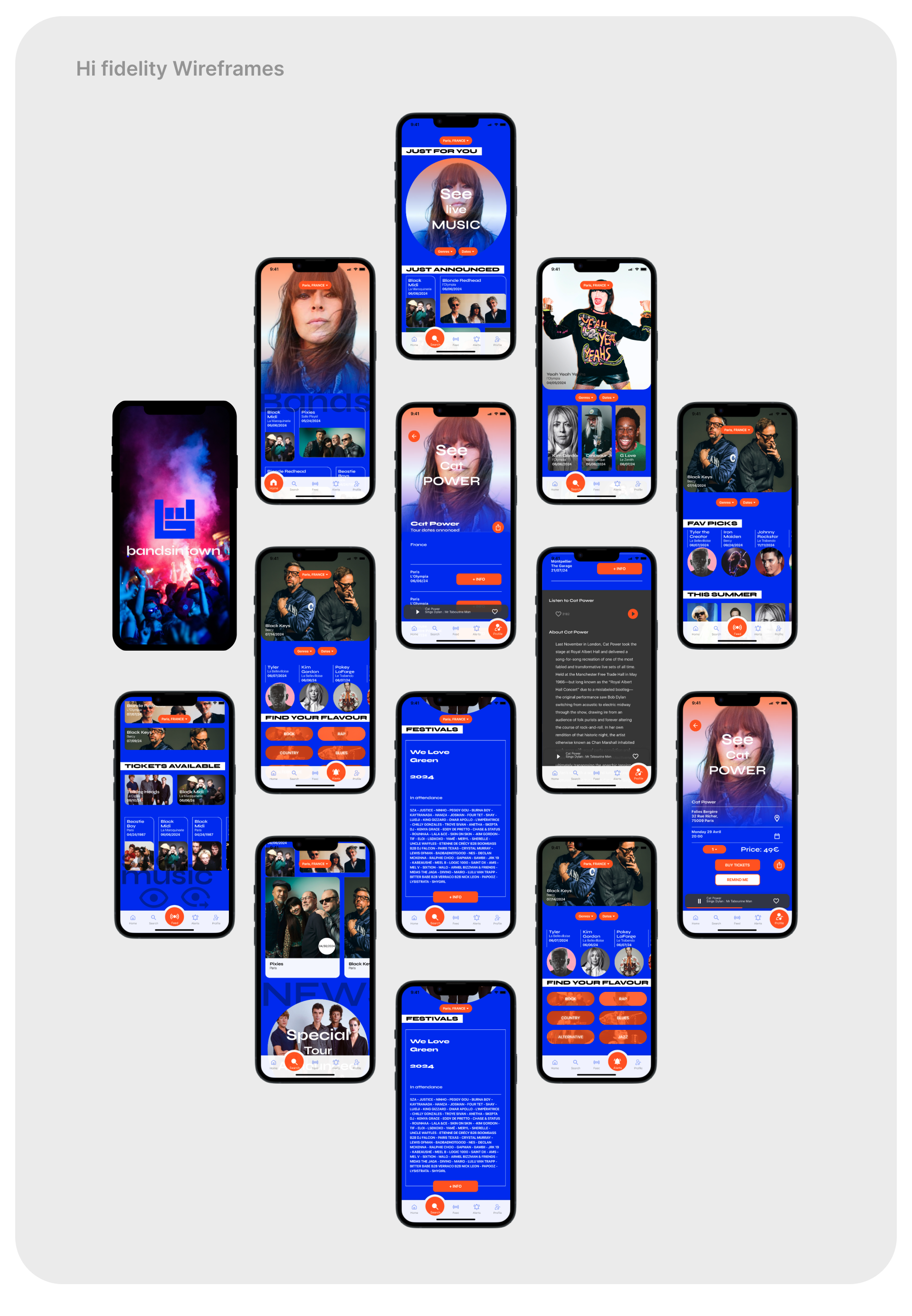
Wireframe : mid-fi Prototype
Visual Design
For the Wireframe I went directly to mid-fi Prototype. I really didn't like the stagnant style of an overly simplified layout formula. The dominance of the black background and the monotony of the layout left me feeling uninterested to go any further. I decided to break from the typical black or white background with square format blocks, currently used on the applications of Spotify and Songkick, for a bento-box style arrangement. Let's try for a variety of sizes and shapes of cards for information, echoing a "musically-influenced" layout. I wanted to make it visually dynamic and not monotone. Seeking rhythmic shapes, colour and breaking monotonous layout patterns to get the users curiosity. Similarly, researchers have found that music enthusiasts search for the 'odd' elements, and irregularities attract the attention, through "disruption" so I tried that concept in this visual design. I opted for a saturated colour palette of blue with orange as a dedicated compliment for buttons and actionable elements.
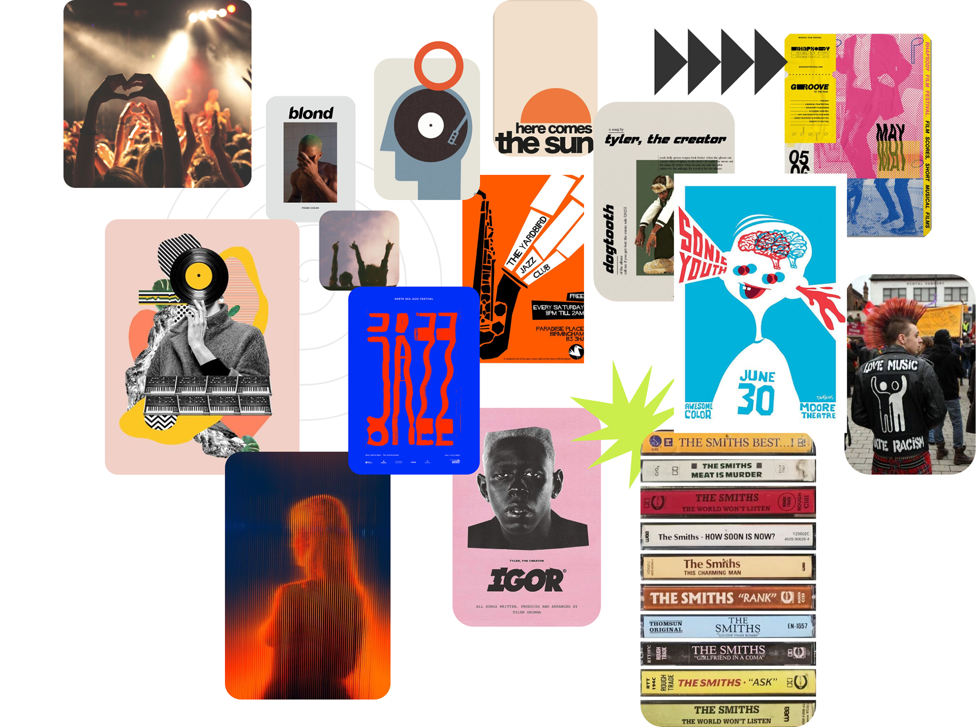
inspiration moodboard

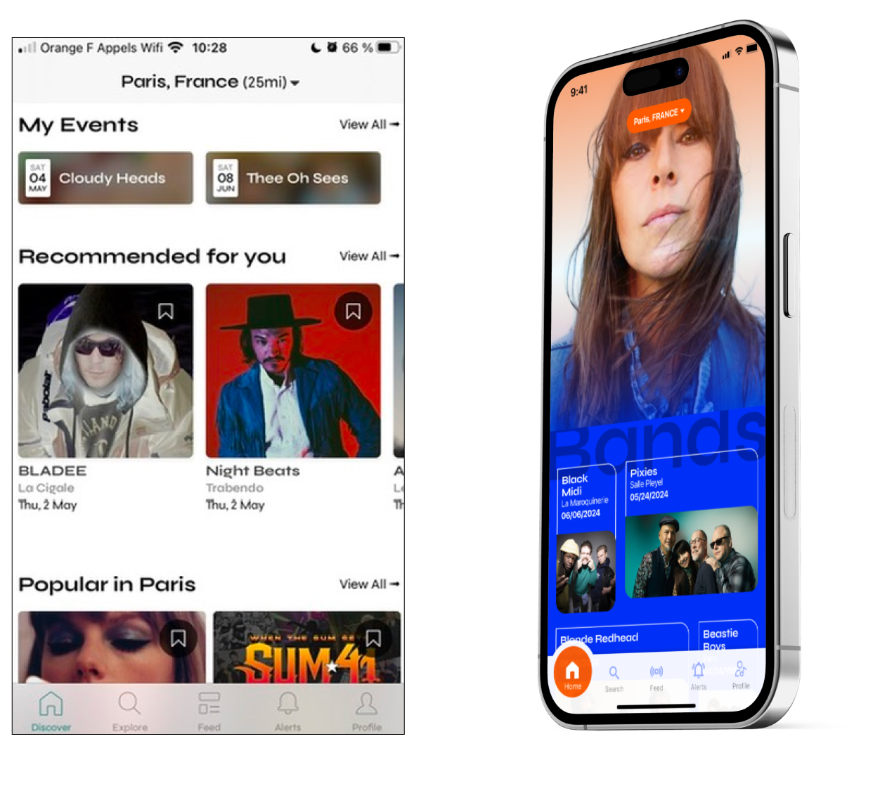
"old" vs. "new", home page design

"old" vs. "new", recommendations page
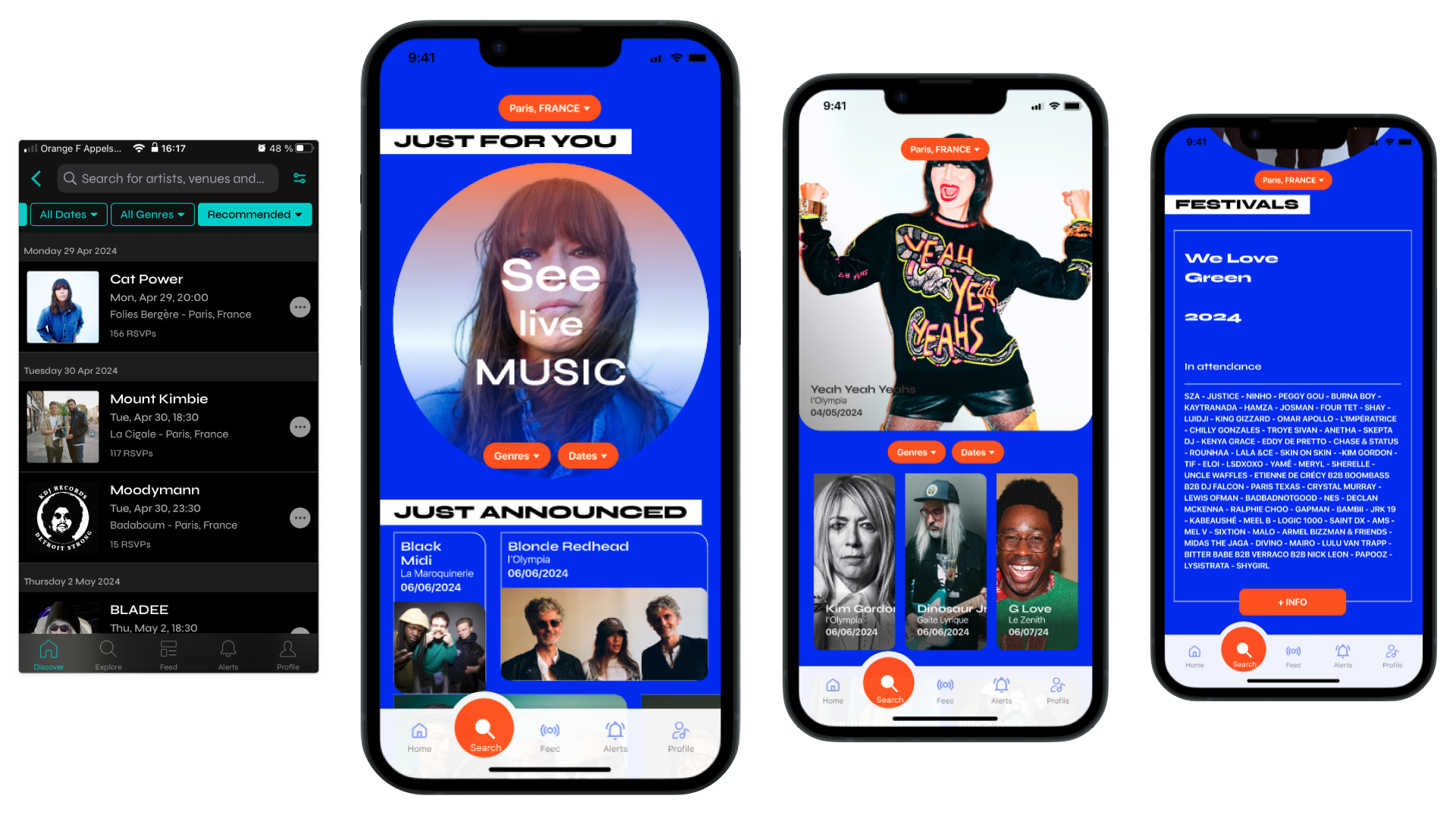
"old" vs. "new" : Just for you, browsing results
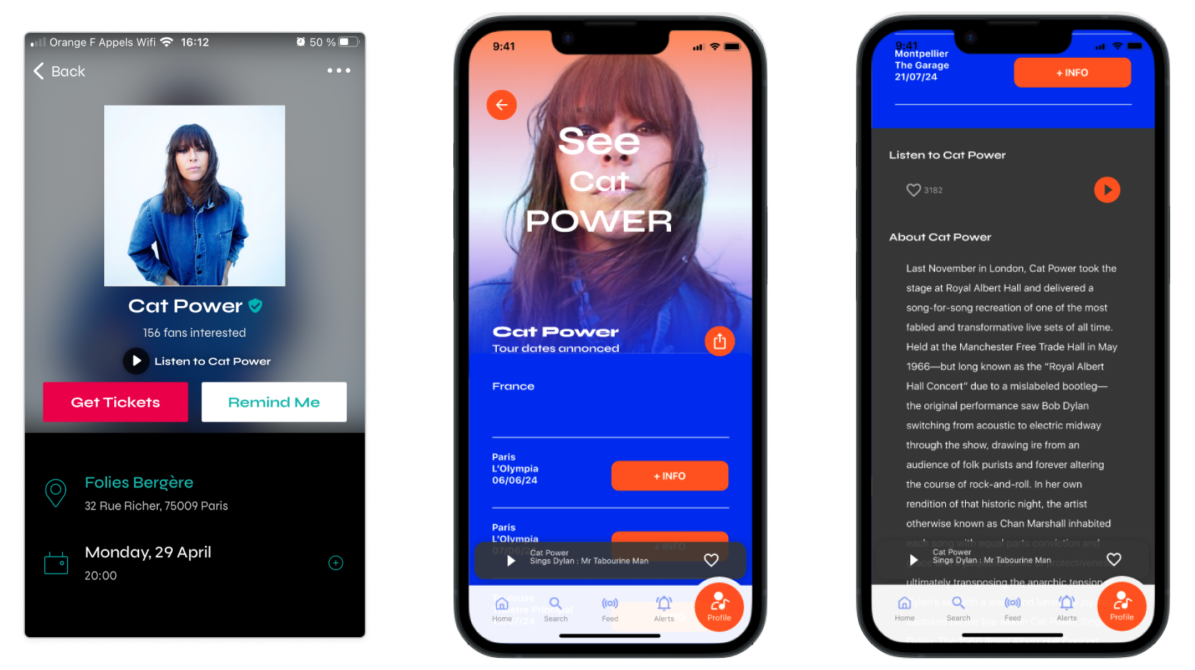
The right two screens : Selection detail and additional info.
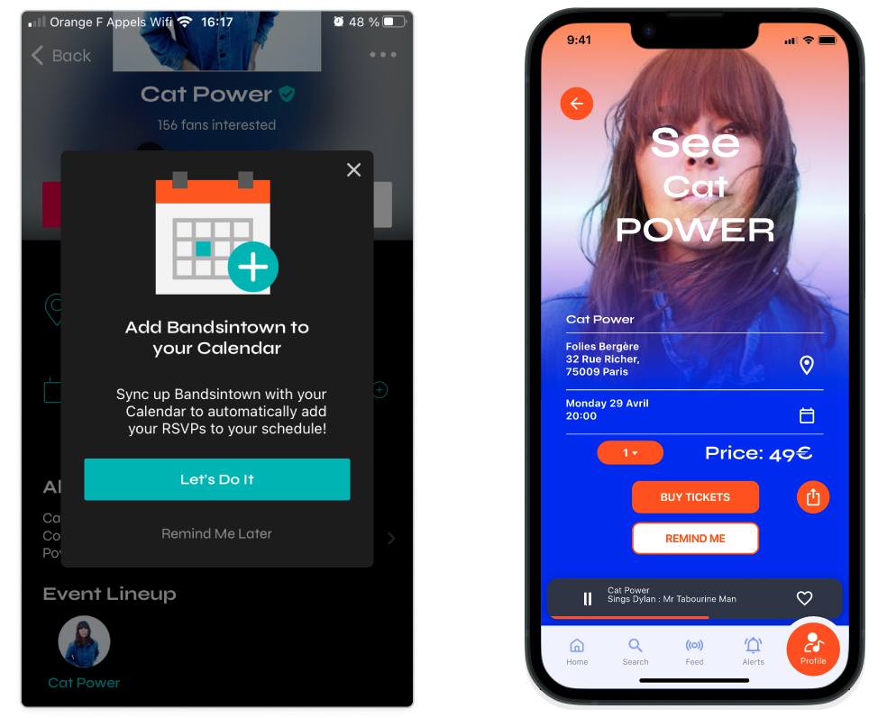
"old" vs. "new", point of purchase
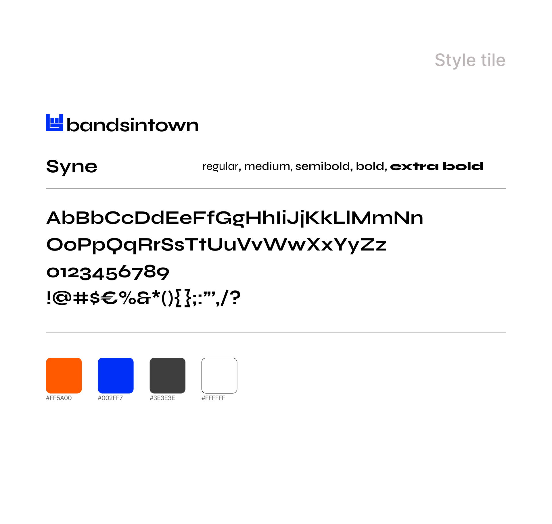
I kept their existing display font face called Syne, best when used large.

Conclusion
I agree that it really should be in accordance with the other existing models in terms of structure & information organisation and yet we don't have to be in lock step formation like soldiers. Music is rebellion, expression and freedom. Today still, posters do a better job of getting people excited about going to a show. The opportunity is to renew the interface using a limited variety of new components to more clearly define different groups of content. To inspire discovery & user engagement, to grow confidence and trust that will help the brand continue to thrive and be supported.
Thanks so much for your time and attention.