Case Study
DOMOrléans
DOMOrléans
Background and Context
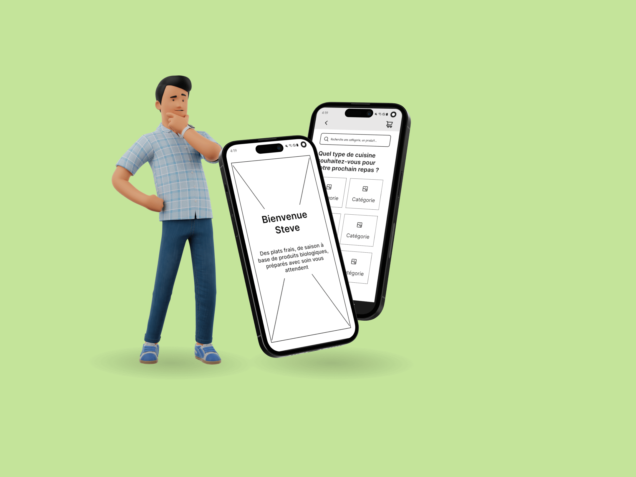
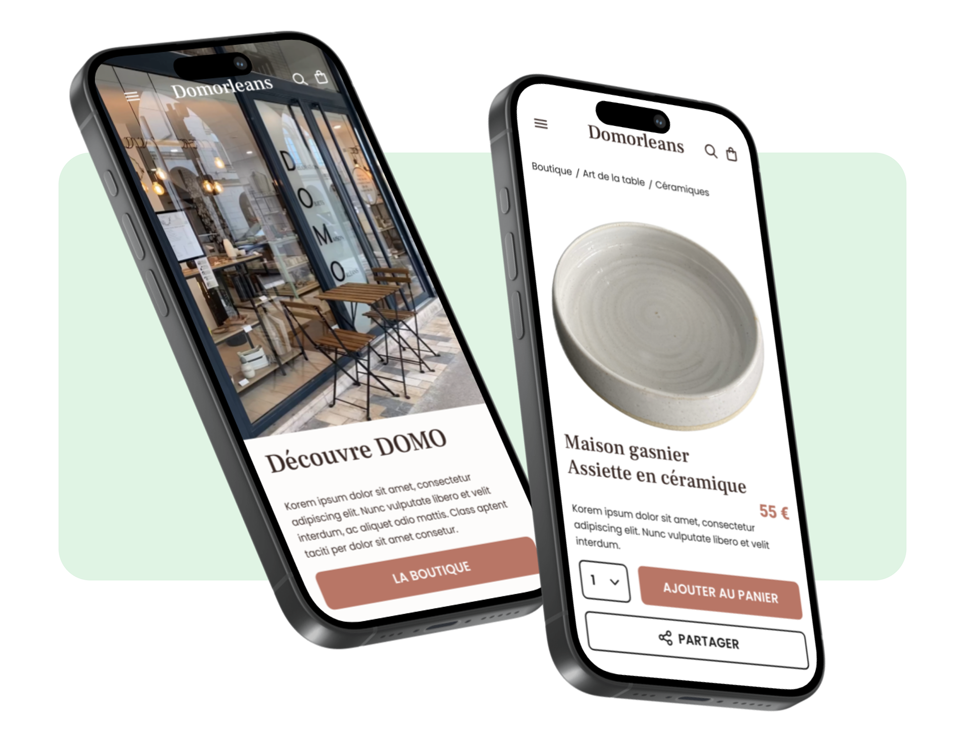
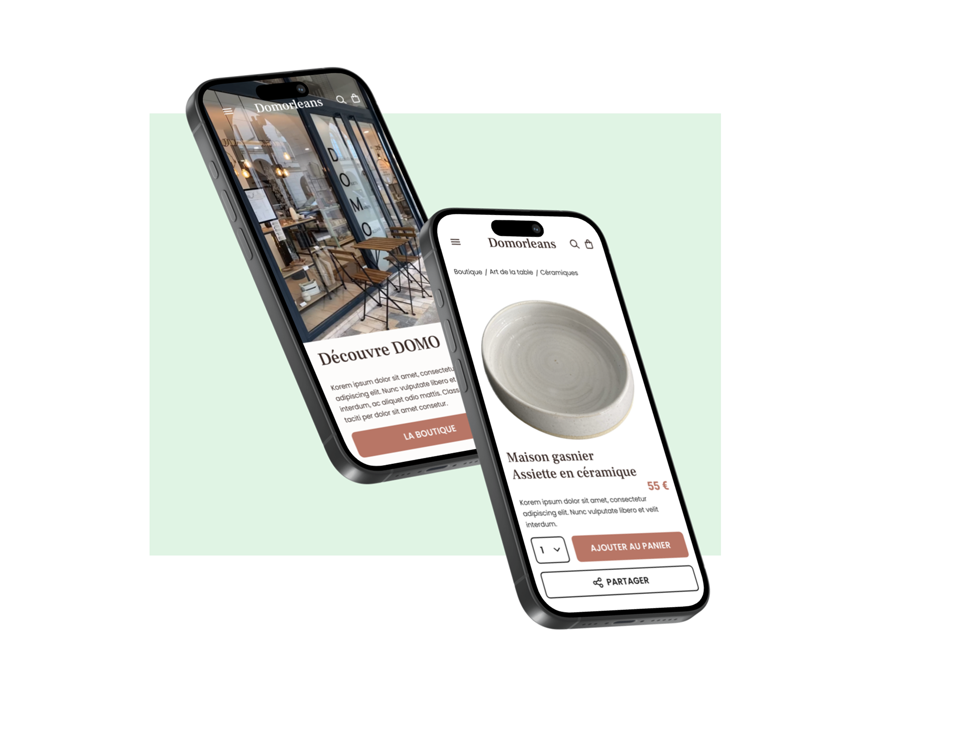
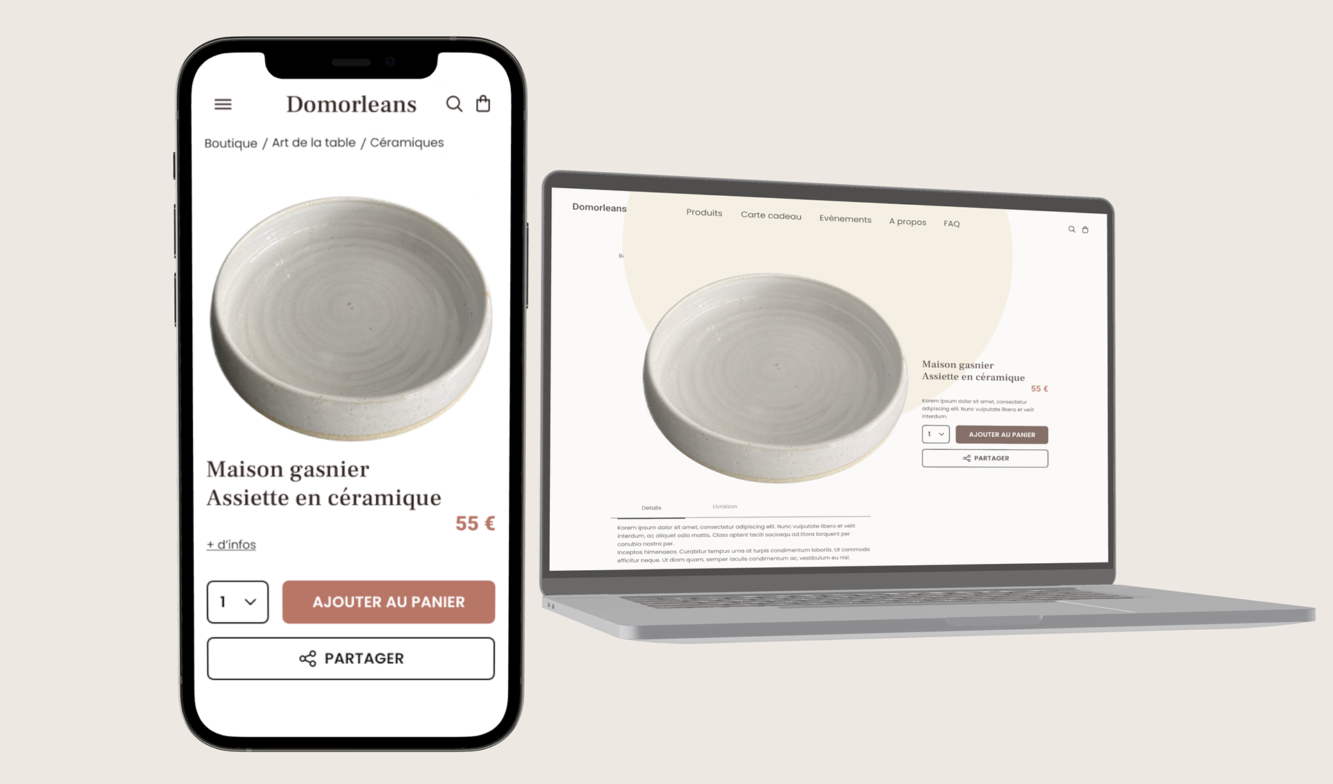
Creation of an M-commerce and E-commerce site for “Domorleans” a downtown boutique Concept store in Orleans, FRANCE.
This concept store offers a mix of home decorations, a welcoming tea lounge, DIY workshops, a place of exhibition for local artisans. She is a dynamic link between the artisans and her clientele. She is listed on Google as a tea shop but that is not her only activity and only represents a small part of her sales. On top of it, she is situated just off of the two main streets in her town, this means less foot traffic, yet there is an important metro stop just in front of her store. People that happen into her shop say, "oh, are you new, never seen your store before". And she replies that she had already been there for 3 years. While she sells such wears as the brand Emile Henry (made in france), they have an ecommerce site and she doesn't pretend that she would sell Emile Henry on her eventual website, yet maybe there are other possibilities.
Discovery and Understanding
We needed to understand the concept, the values, the current situation, the positives and the negatives for this store owner, the priority problems and future projects, interviewing the stakeholder.
We needed to understand the concept, the values, the current situation, the positives and the negatives for this store owner, the priority problems and future projects, interviewing the stakeholder.
Benchmark and Heuristic evaluation
Because of no existing e-commerce website, it was necessary to do a benchmark evaluation of online boutiques of similar size and type of offer. We conducted a qualitative inventory of their pages, content and offerings where we made a chart of the content and the site architecture.
Problems and Hypothesis
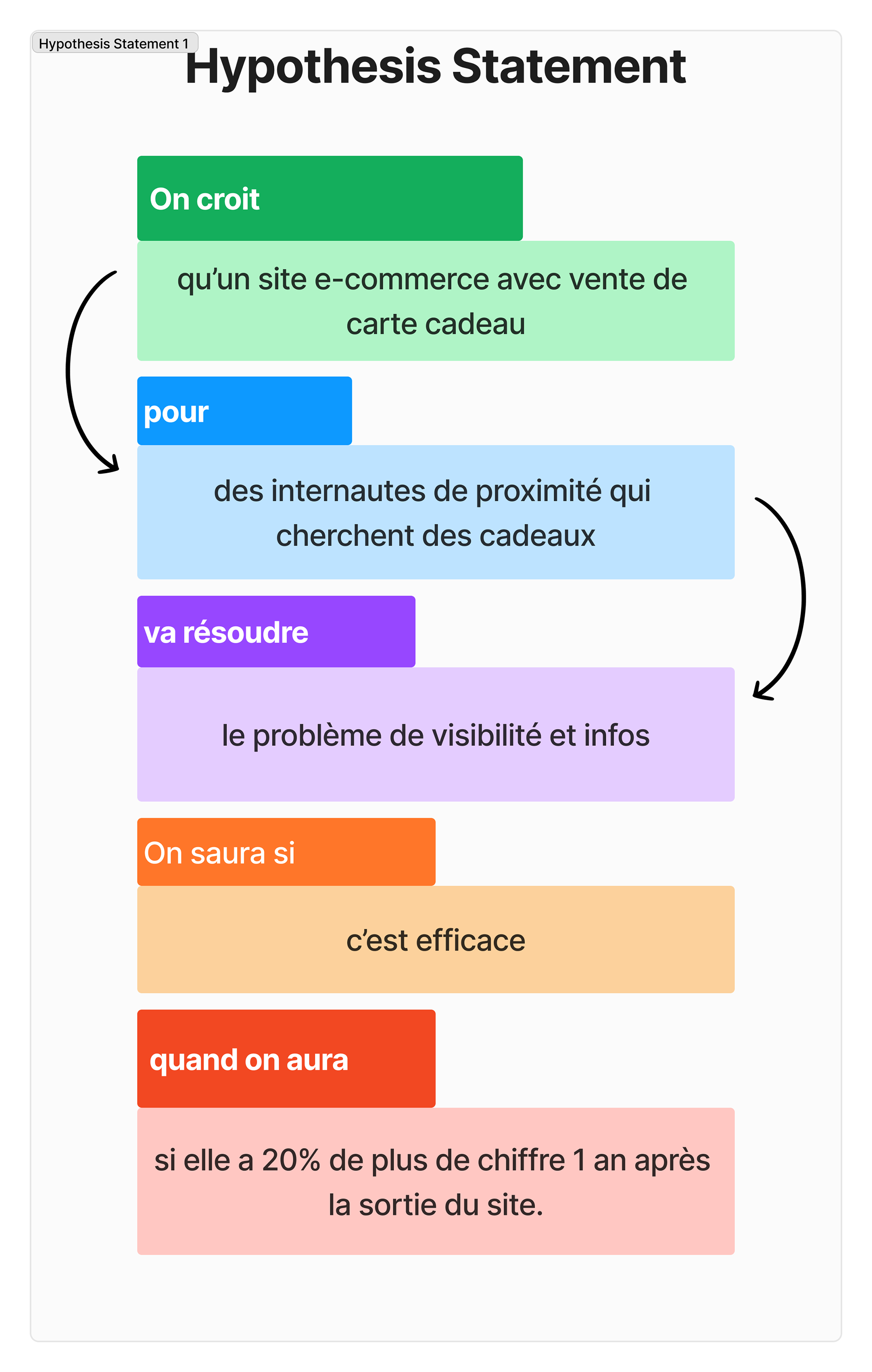
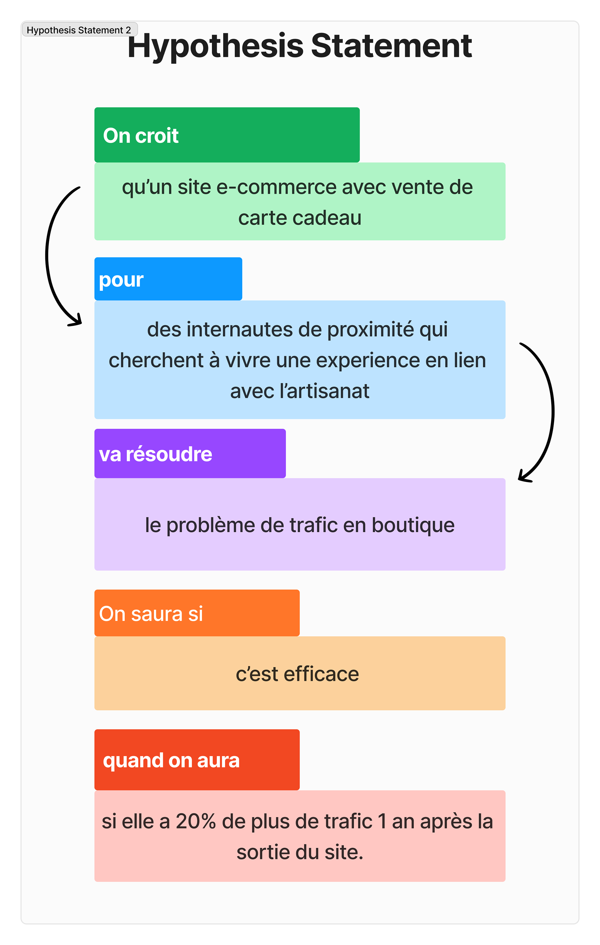
We believe that an e-commerce that sells gift cards for online shoppers who live nearby and who are searching for a gifts will solve the problem of accessibility and visibility of her store. We will know we are right when there is a 20% increase in sales after the launch of the website.
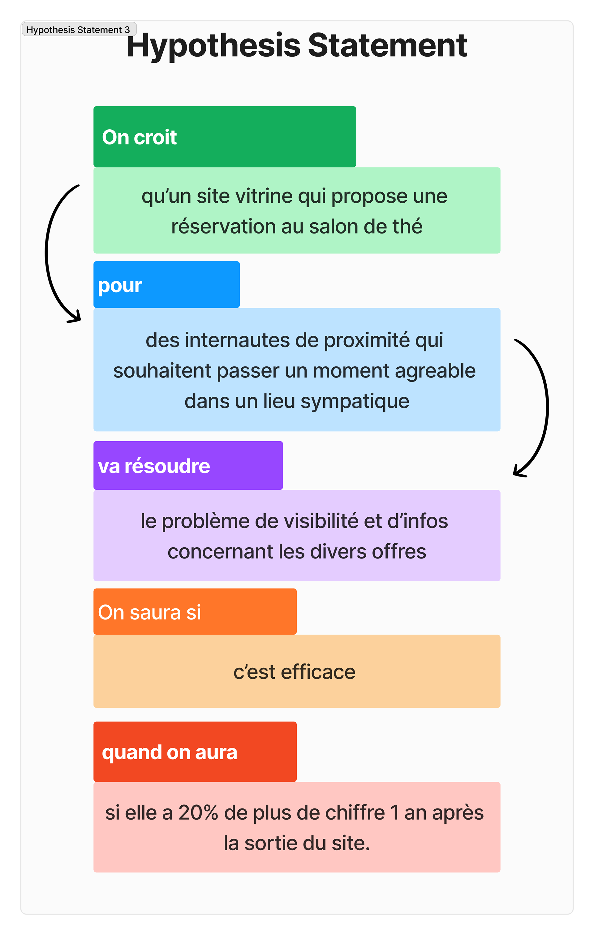
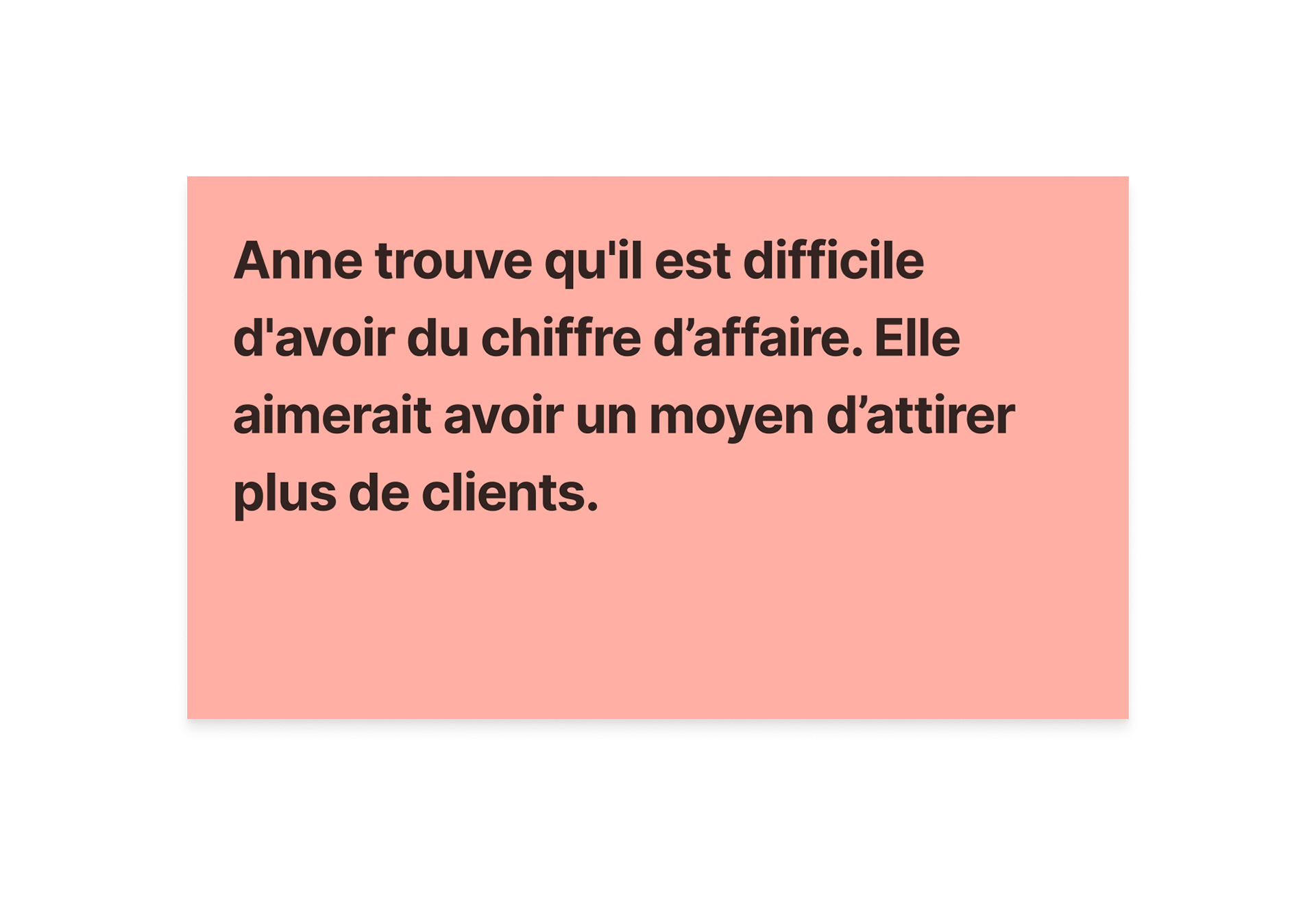
The hypothesis statements helped formulate the Problem Statement (here below on the left). Anne finds it difficult to make enough money at the end of the month and that she would like to attract more clients.
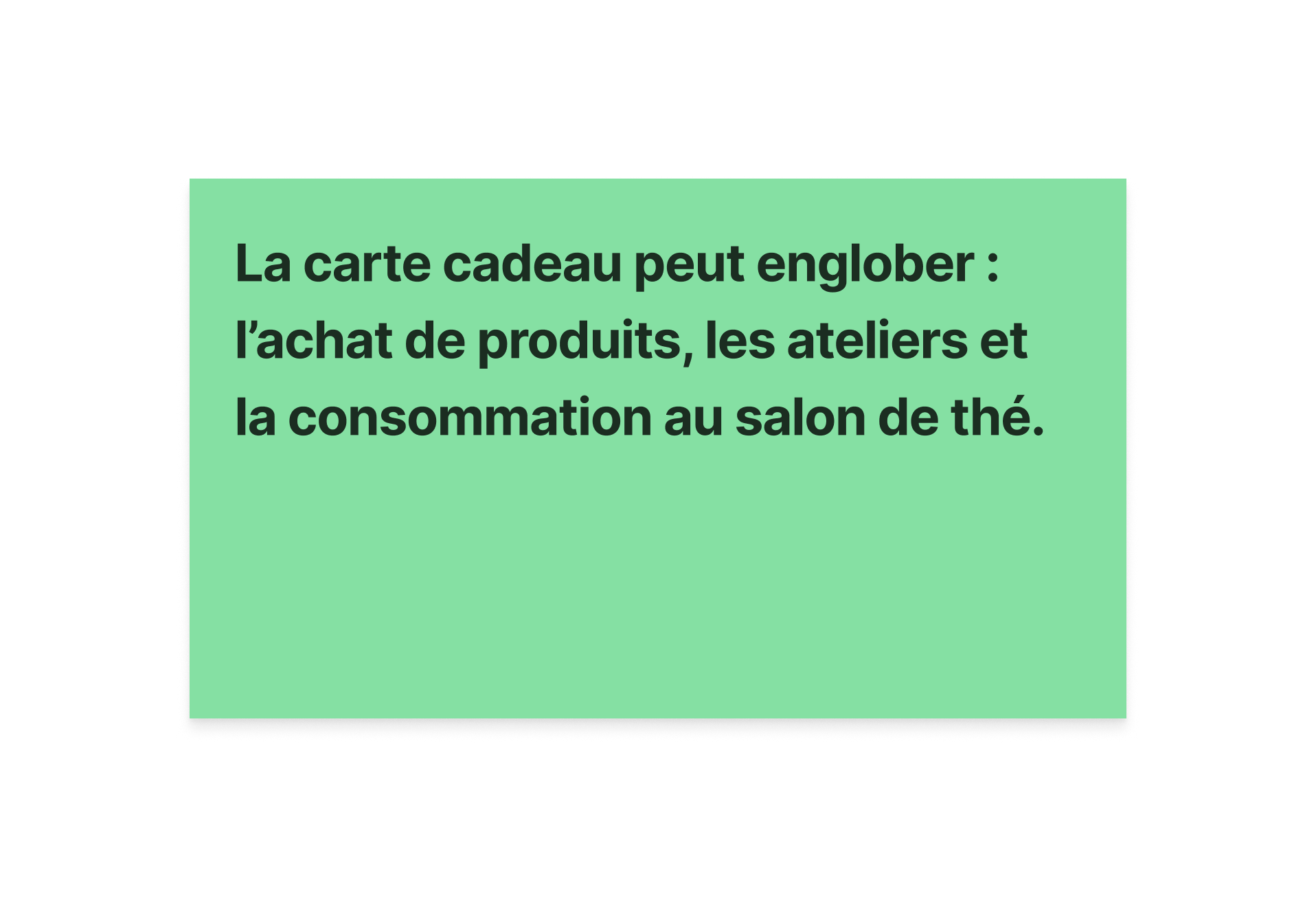
The Problem Statement helped formulate The Solution Statement : The online presence including the sales of gift cards would include the sales of products, workshops and the consumption in this boutique/tea salon.
The Problem Statement helped formulate The Solution Statement : The online presence including the sales of gift cards would include the sales of products, workshops and the consumption in this boutique/tea salon.
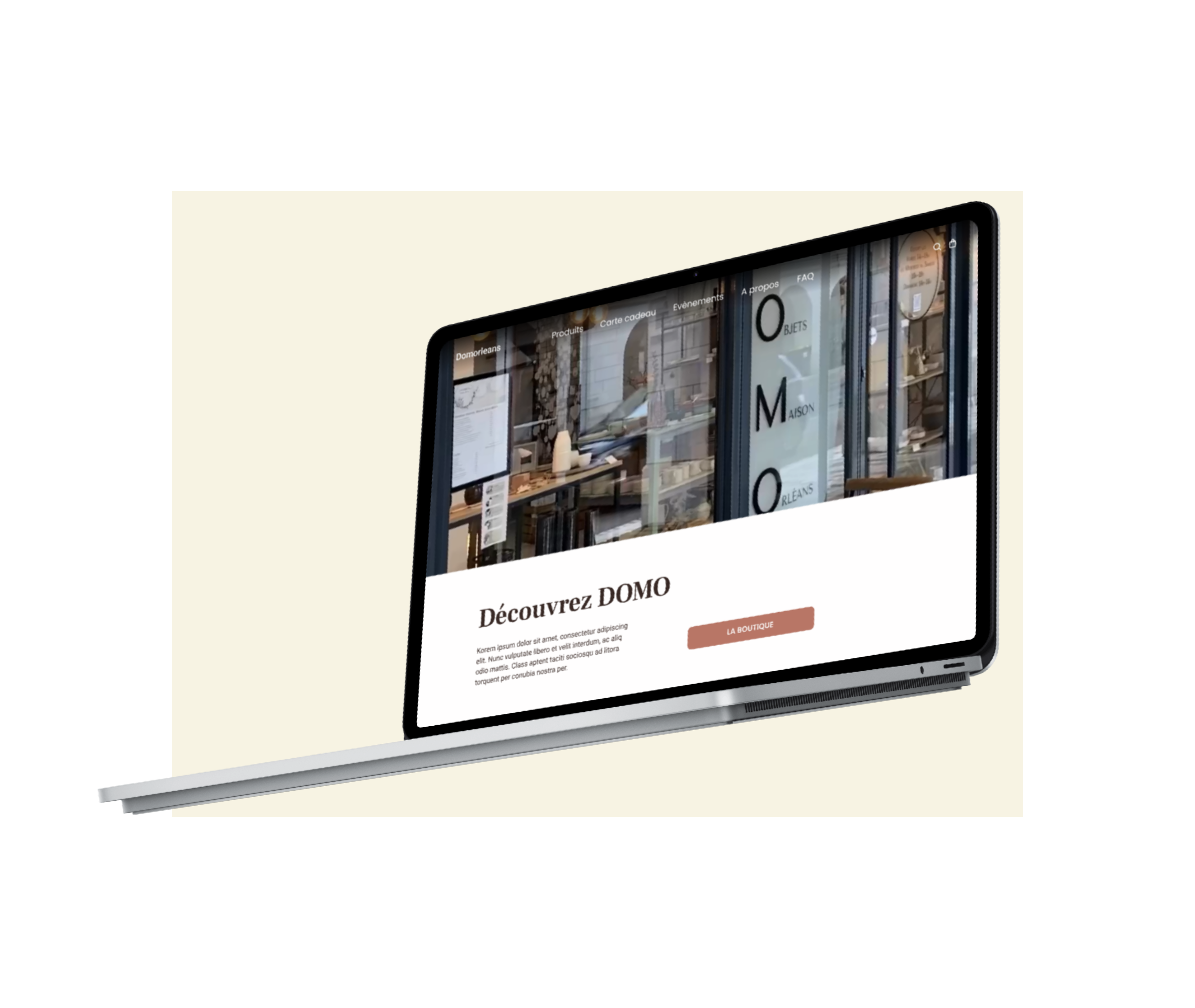
Site-map :
1. A shop organized by two types of products composed themselves of a single
level of subcategory.
2. Page event gathering the the other services (tea room, exhibitions, workshops).
Menu for quick access to basket, search function and connection/registration.
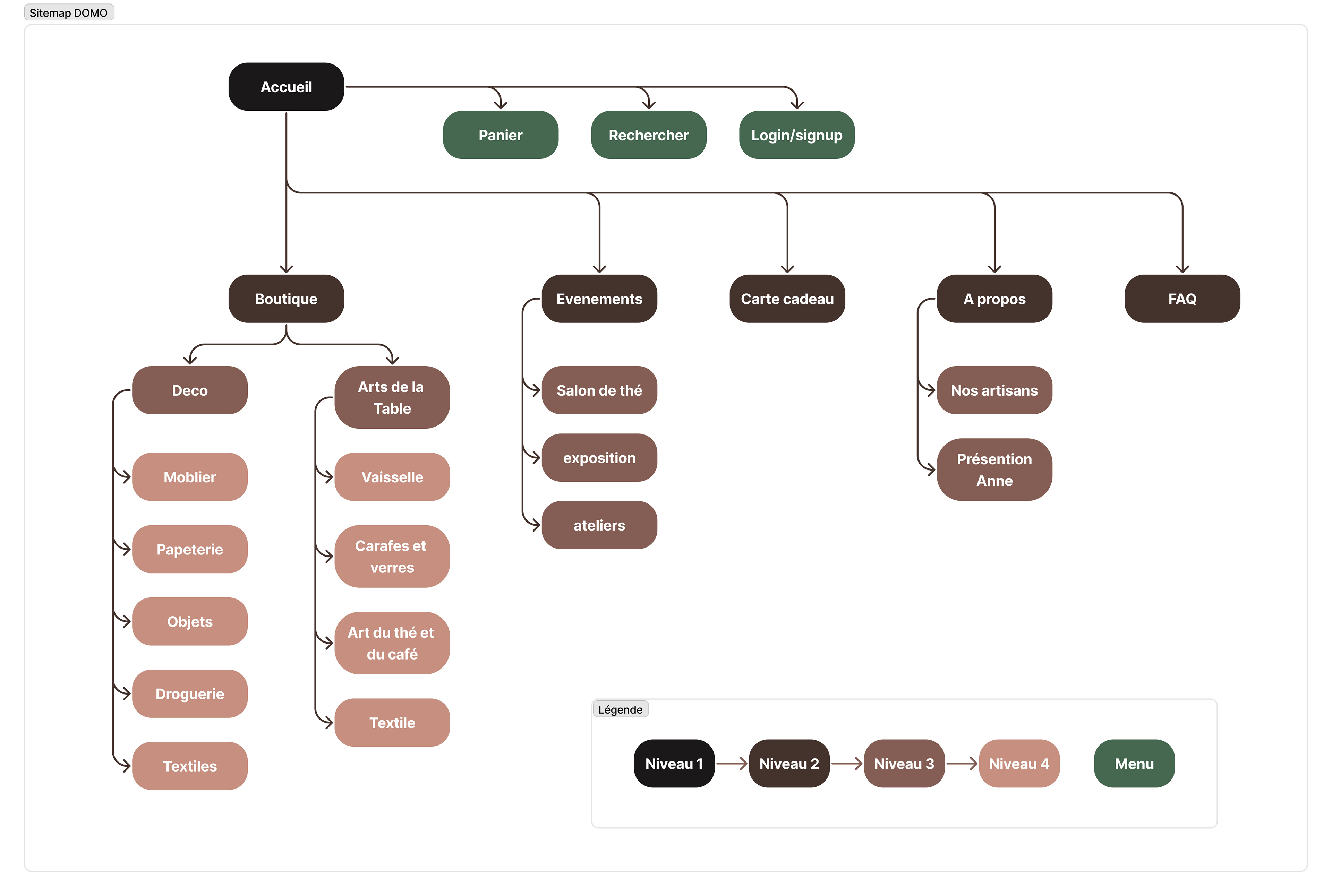
Clarification by the difficulties the shop owner is having gave evidence of how to structure her content online. This gave insight on how to structure her content, her concept store; a boutique that also serves as a tea salon and hosts workshops, and gallery events. The site map was a way to share this as a mental model and build upon it a low fidelity prototype.
Mid-Fidelity wireframes
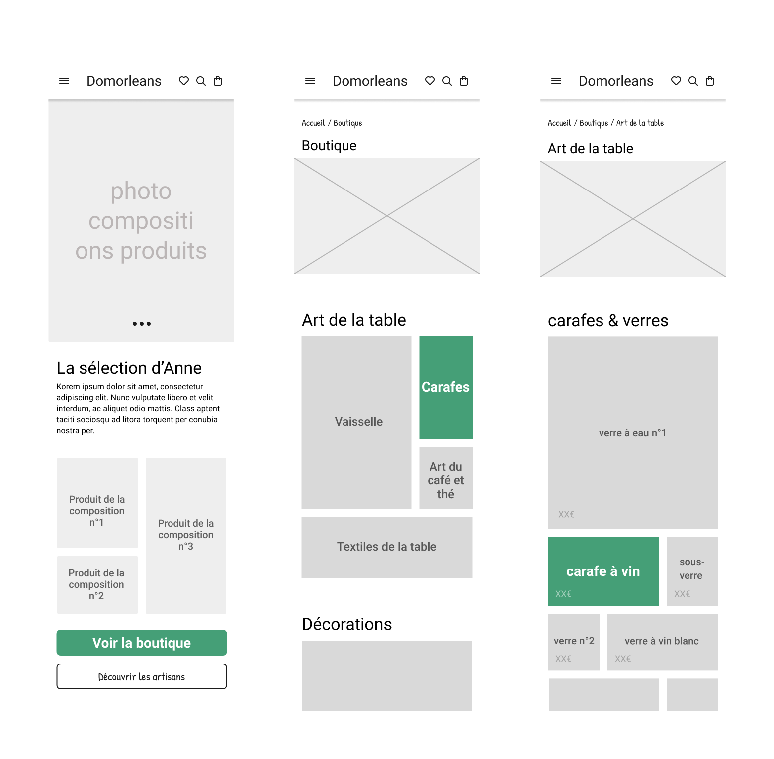
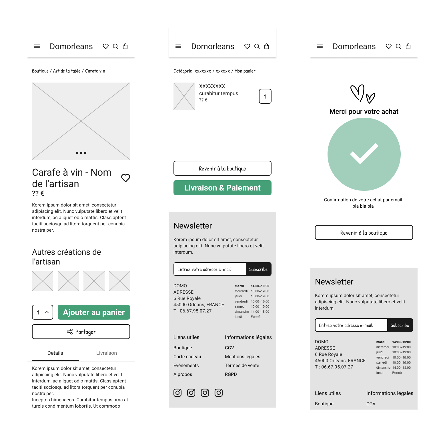
The creation of a mid-fidelity prototype allowed for a qualitative analysis of our hypothesis. We conducted interviews with 5 different users. My teammates and I registered our interviews using video of the users interacting with our prototype, this included audio as well as written notes. We asked them to complete a task, to find a particular product and then to purchase it. We encouraged our subjects to externalise their thoughts as to what they were doing, why they were doing it and if they were silent, we would inquire what they were doing or thinking. We were cautious not to have influence on our subjects, this is an observational analysis. We were able to extract data from the prototype tests. The System Usability Score was 90/100 which is excellent. We heard comments, such as 'it is practical and efficient". But the concept of Anne's boutique was unclear.
We heard such things as, "access to the boutique" should be visible more quickly and that the label "Events" wasn't clear, and "why group the Tea Salon with the Workshops? They should be separated".
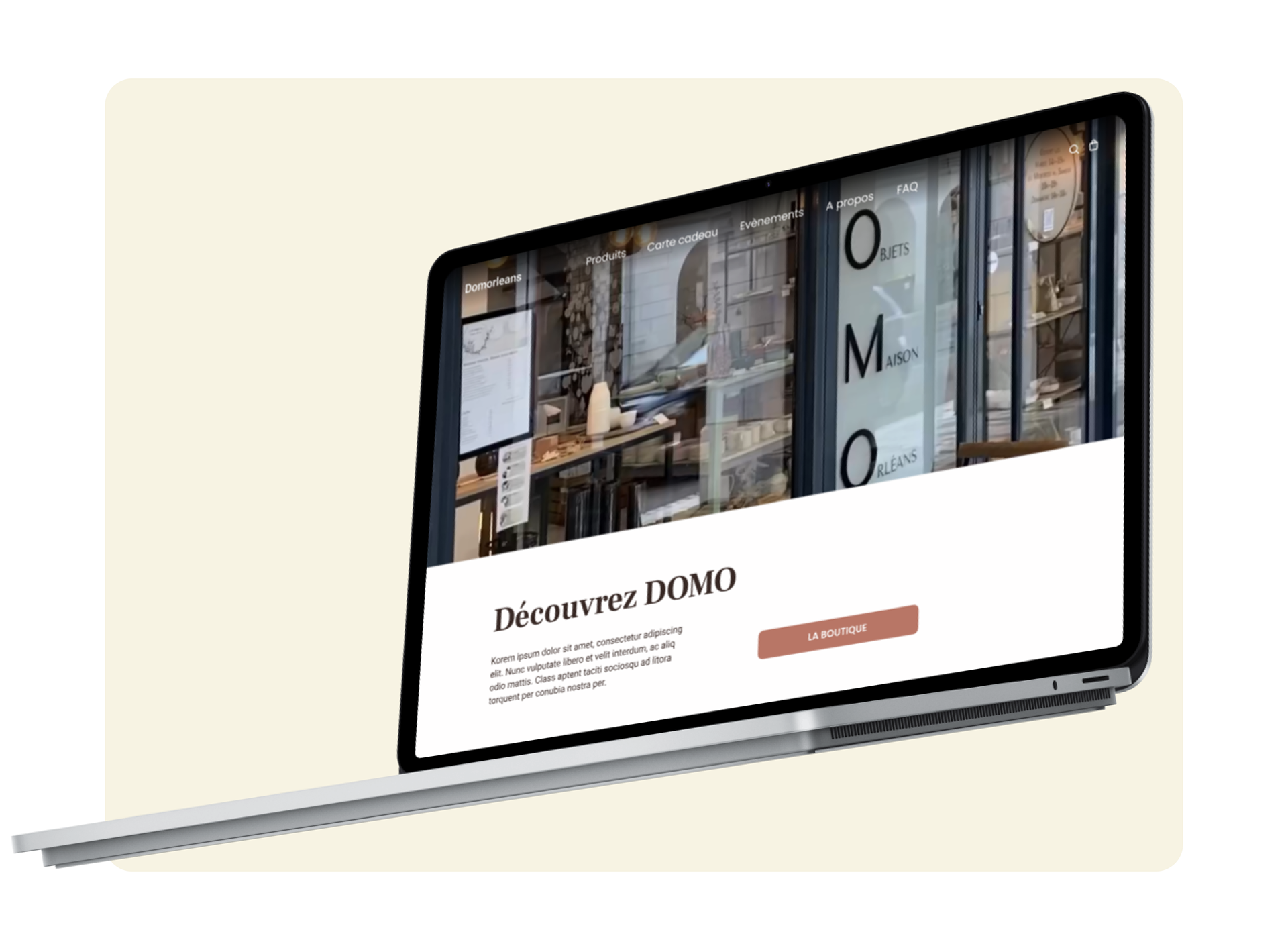
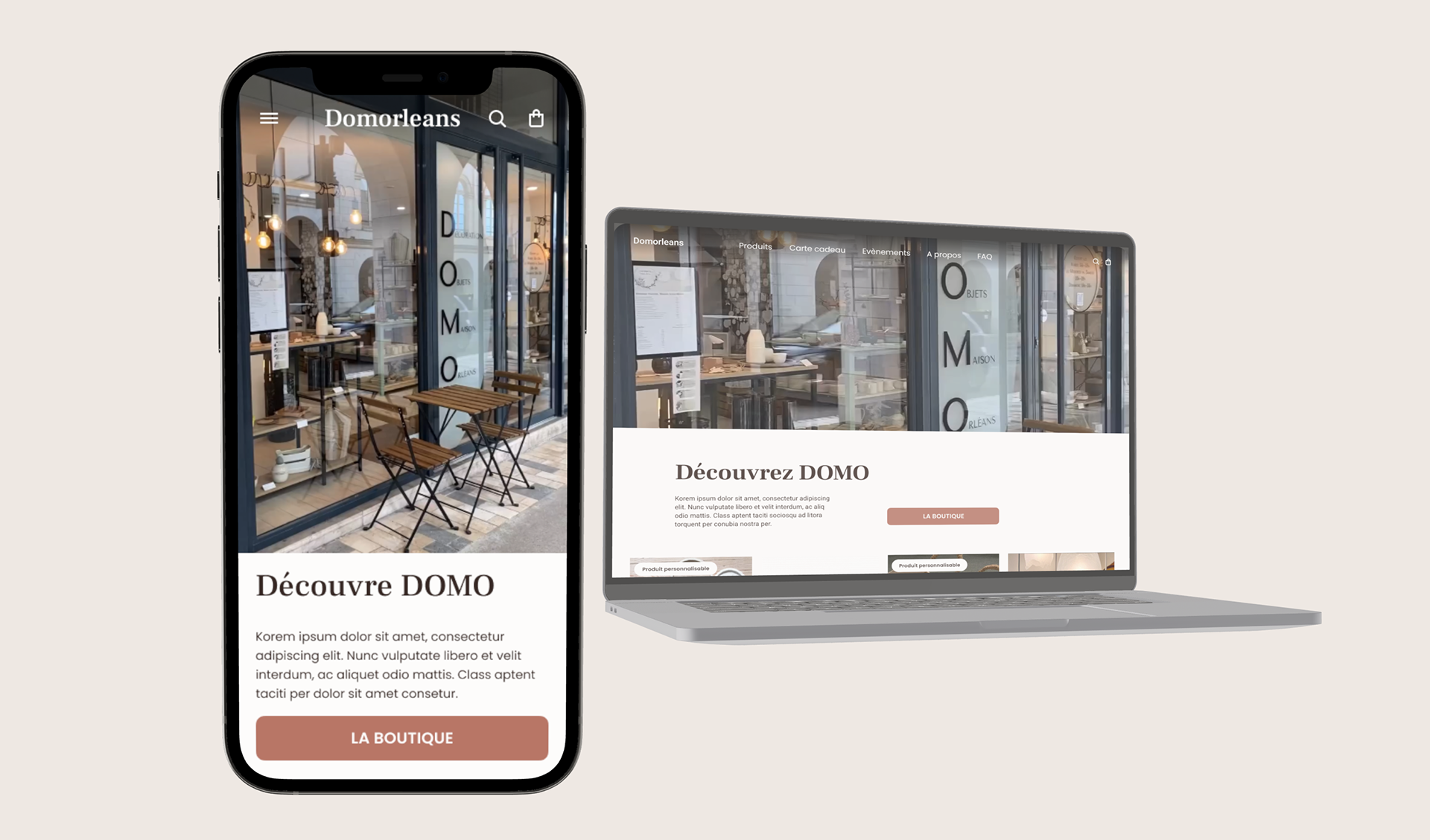
With this information we were ready to iterate a hi-fidelity prototype, yet we needed to define the brand of DOMO, to understand what it is and is not.
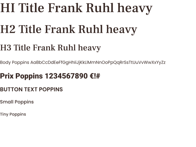
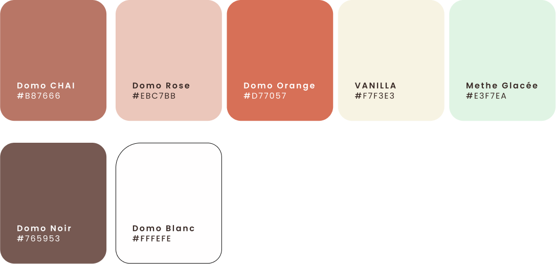
Each created moodboards, including words, images, colors, music, anything that adds dimension and definition to our design. We were able to share these boards with each other and this gave us lots to talk about and gave us common ground upon which we were able to delegate different aspects of the design. This also gave us the ability to share with the shareholders where we were headed and why. This is a time-saving step because it helps get everyone on board and reduces conflict of interest. Have faith in the process and be transparent at every step of the way.
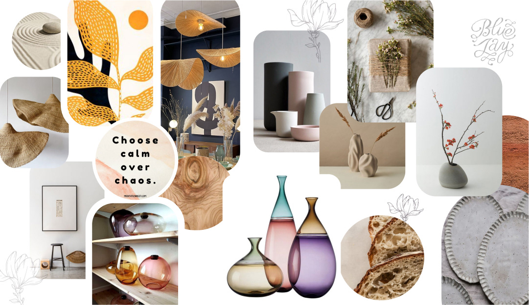
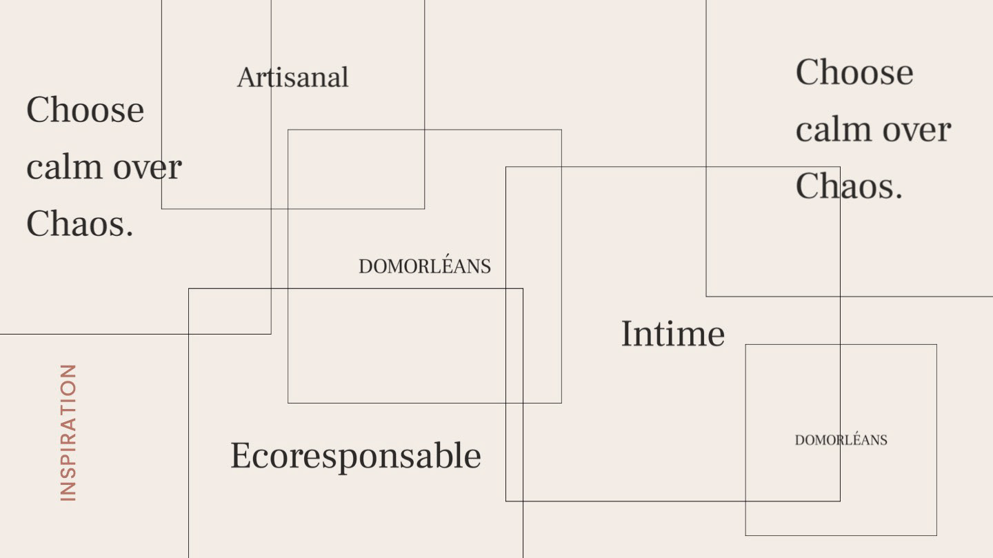
We found these keywords that surfaced as values that define Domo.
This was a weeklong project. We went rapidly through the Design thinking process, from discovery to definition, from ideation to prototype and then we tested. We came to learn from our prototype that we had a good base to build upon. Our first version of the prototype I didn't share here in the Case Study because we went to quickly into the details and we lost our focus of the problem, we had changed focus on the product. It is a subtle difference in speech but has a large impact on what we give importance to. It must be functional and it must be aesthetically pleasing. For an e-commerce website or a mobile commerce site we must design for our users, and we must dazzle them into our store, it must not be boring or redundant, or we will lose our customer. It must follow a certain logic of organisation and that, we were able to achieve by modifying our site map based upon the feedback that we got. We are reminded that we are not the customer, so we must regularly check in with the customer, to be sure that we are reaching our target audience.
Thanks for your visit.